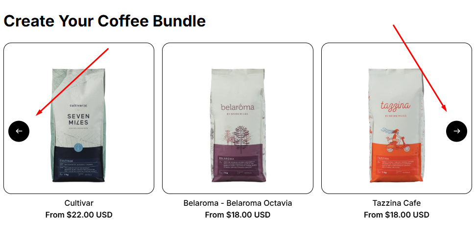
The Carousel layout is a dynamic way to showcase products by allowing customers to scroll or swipe horizontally through items. Built on the same foundation as the Product List: Grid, the Carousel uses identical settings but presents products in a slider format instead of a static grid.
👉 In this guide, we’ll cover:
- How to add a Carousel layout to your store
- Key settings specific to Carousel (like layout type and slider behavior)
👉 For all other settings (product sources, default selections, requirements, advanced options, visibility, attributes, and detailed styling controls), refer to the Product List: Grid, since Carousel uses the same configuration.
How to Add a Product List: Carousel #
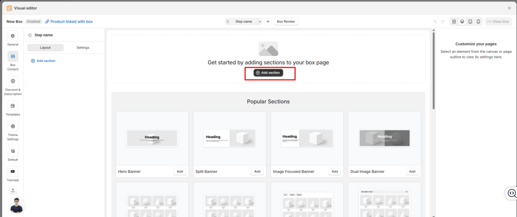
- Click Add Section from your Box Content.
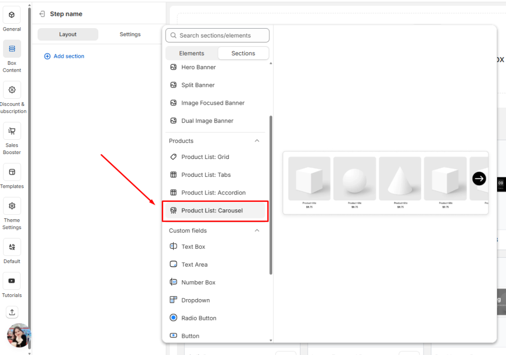
- Select the Product List: Carousel in your layout.
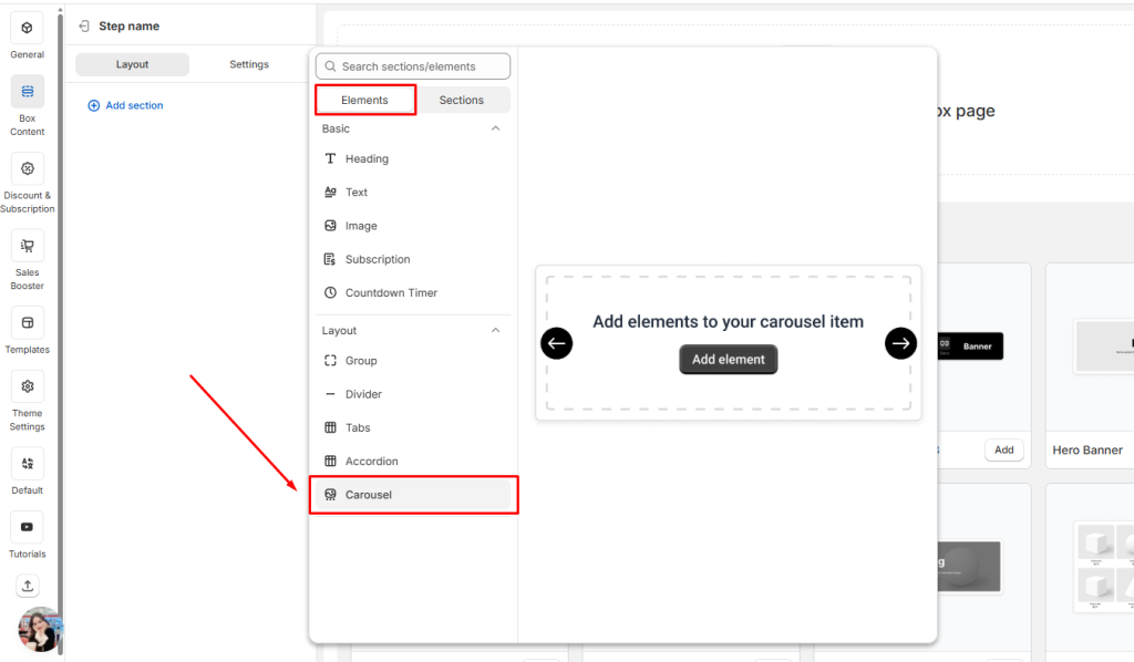
Or choose the Carousel elements in the Elements tab.
Once added, you can adjust how the carousel looks and behaves using the settings below.
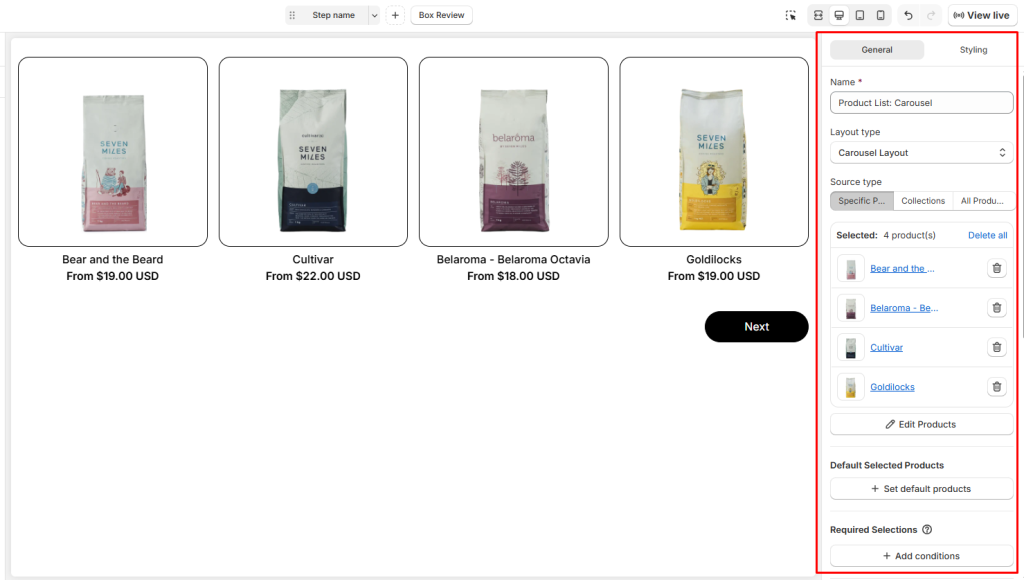
General Settings #
In the General tab, you’ll configure the basics:
- Name: Give your product list an internal name so you can recognize it later.
- Layout Type: Choose between Carousel layout or Grid layout. In this document, we will let it stay as Carousel.
- Source Type: Decide what products to show:
- Specific Products: Hand‑pick items.
- Collections: Pull products from a Shopify collection.
- All Products: Display your entire catalog.
Other Settings #
👉 For a full breakdown of other settings (Styling options, product list source, required selections…), refer to the Product List: Grid guide.
💬 Need Help? #
If you run into any issues or have questions, feel free to reach out via our in-app 24/7 live chat. We’re always here to help!