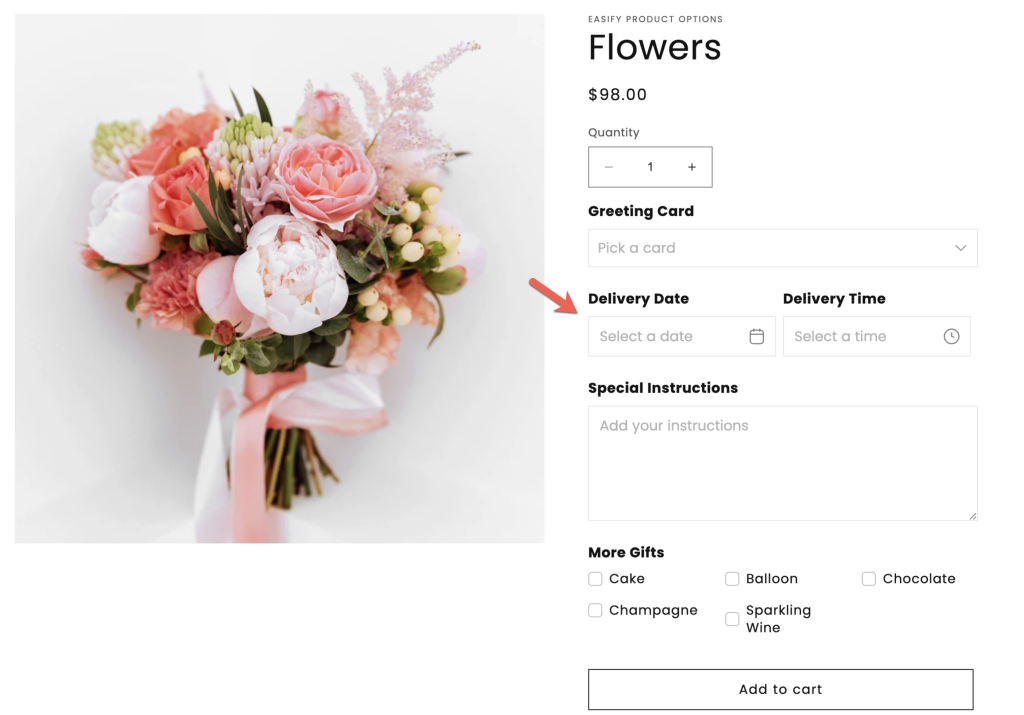
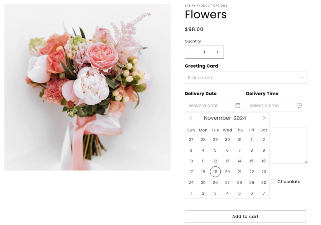
The Date Picker in Easify Product Options offers a seamless calendar tool for customers to choose a specific date, ideal for scheduling deliveries or store pickups.
This option type is available on the Pro and Premium plan.
Unlike standard date pickers in other product options apps, Easify’s Date Picker goes beyond by allowing you to:
- Block Out Dates: Restrict specific days, weekdays, or weekends, and set dates before/after a specific date.
- Set Lead Time: Ensure customers can only select dates after a set preparation time.
- Disable Past Dates: Automatically prevent past dates from being selectable.
- Add Extra Charges: Apply additional fees for date selections (+$x.xx).
- Customize Date Format: Tailor date displays to fit your preferred format.
- Enable Cutoff Time: Offer same-day or next-day delivery options with cutoff deadlines.
With these robust features, Easify empowers you to manage both date selections and create other custom options, all within a single app.
- Time Picker: The Date Picker can pair with the Time Picker for both date and time selection.
- Date Range: For scenarios requiring a broader timeframe such as rental services, using the Date Range is a more fitting choice. Unlike the single-date selection of the Date Picker, it empowers customers to pick a range of dates (selecting the start and end dates).
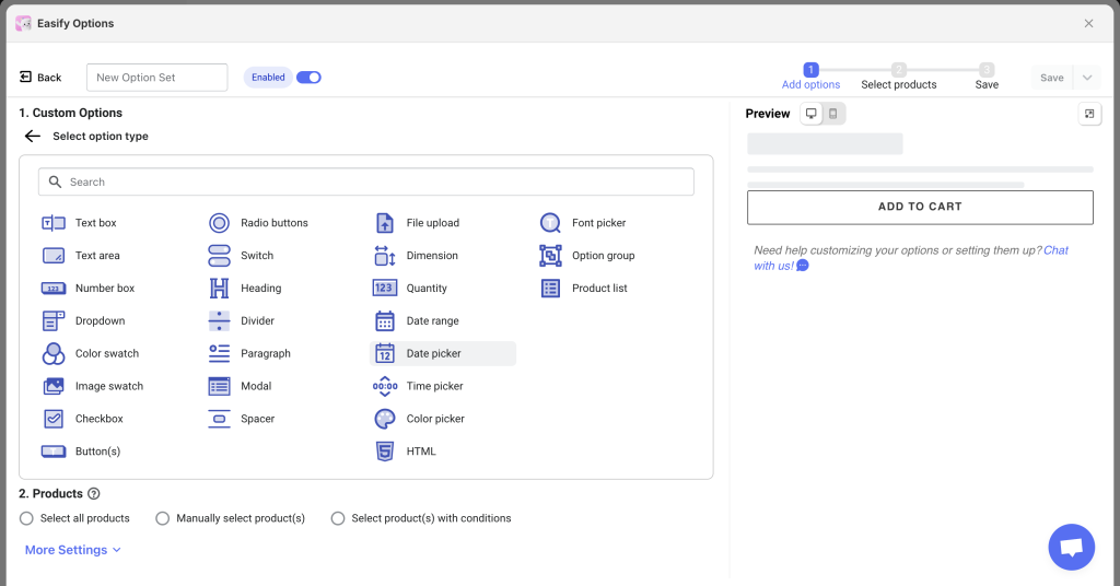
Option Settings #
Basic settings #
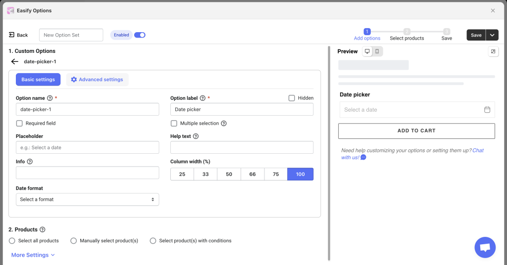
- Option name: Give your Date Picker option a unique internal name, which will also be visible to your customers. Ensure that different options in the option set have distinct names.
- Option label: Add a label that is visible to your customers such as “Delivery Date”. Option labels can be the same or different for various options in the option set.
- Hidden: Hide the option label if you want to keep the interface cleaner or prefer it not to be visible to users.
- Required field: Make the Date Picker a mandatory field if you want, ensuring customers select a date before adding the product to cart.
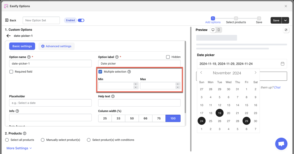
- Multiple selection: By default, customers can only select one specific date from the calendar. If you allow customers to select multiple dates, select the “Multiple selection” checkbox and set the minimum and maximum number of dates allowed for selection, or leave it as default for unrestricted selections.
- Placeholder: Add a short text inside the date picker field when no date is selected yet. For instance: “Select a date”, “Select your delivery date”.
- Help text: Provide additional instructions or information for your customers to assist them in the date selection process.
- Info: Create an informative tooltip that appears when users hover over a small icon, providing more context or assistance.
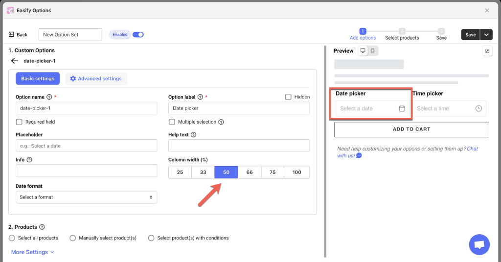
- Column width: Adjust the width of the Date Picker field if you want, choose from 25-33-50-66-75-100%. For instance, if you intend to incorporate both the Date Picker and Time Picker on a single line to optimize the product page space, simply adjust the column width of each to 50%.
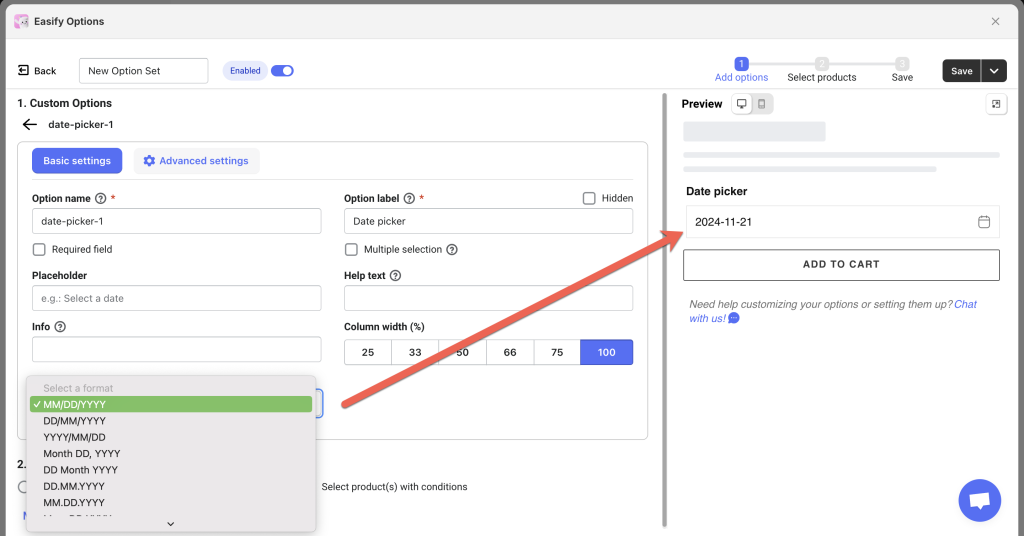
- Date format: Choose from 10 different date formats to match what your customers are most familiar with.
Advanced settings #
1. Cutoff Time (Premium): #
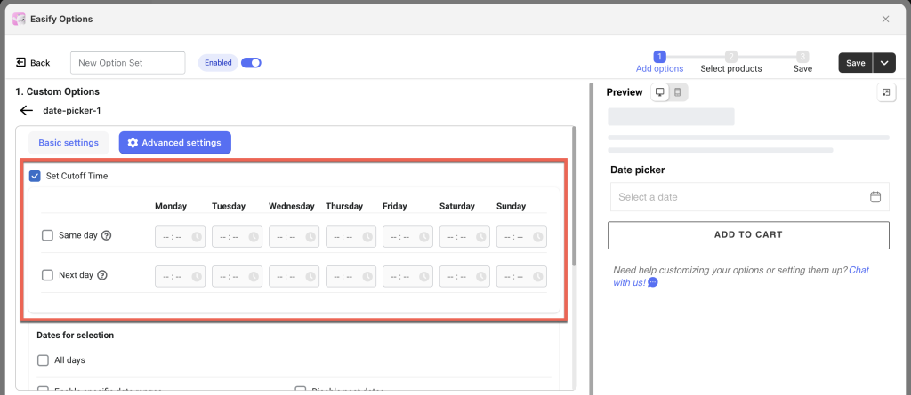
You can set a cutoff time for each day of the week. If you don’t need a cutoff for certain days, just leave them as default. You can also set both Same-day and Next-day cutoff times.
- Same day: Set the latest time you can accept orders for Same-day delivery. E.g., if you set the cutoff time to 2 PM and a customer places an order at 3 PM, they won’t be able to select today for delivery.
- Next day: Set the latest time you can accept orders for Next-day delivery. E.g., if you set the cutoff time to 5 PM and a customer places an order after 5 PM today, they cannot select tomorrow for delivery; the earliest available date will be the day after tomorrow.
2. Date for selection #
Specify the date range within which customers can make selections.
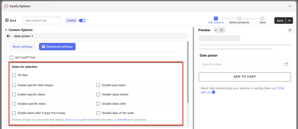
ALL DAYS: #
By default, customers can select any date on the calendar.
Use case: Ideal for general-purpose stores without specific date constraints, allowing customers the convenience of choosing any day.
Notes: When “All Days” is selected, other date restriction settings and the “Cutoff Time” feature will be disabled.
BLOCKOUT DATES: #
a. ENABLE Options:
- Enable specific date ranges:
Define 1 or multiple date ranges available for selection. Customers can only choose dates within these ranges. Click on the field to select the start and end dates for each range. Click “Add range” to include additional date ranges.
Use case: a florist might use this feature to allow customers to select delivery dates only during holiday periods like Valentine’s Day or Mother’s Day, ensuring availability during peak seasons.
- Enable specific dates:
Restrict customers to choosing only from a predefined list of dates.
Use case: Perfect for event-based products like concert tickets, workshop enrollments, or special event services where the service/product is only available on certain dates.
b. DISABLE Options:
- Disable specific dates:
Specify certain dates to be disabled, preventing customers from selecting them.
Use case: Useful for days when the store is closed, such as public holidays, maintenance days, or blackout dates for delivery services.
- Disable past dates:
To prevent customers from selecting past dates, enable this option. If you consider “today” (the order placement day) as a past date, also enable the “Include today” checkbox to block both past dates and “today”.
Use case: Ensures customers can only select future dates for deliveries or appointments, such as in online booking systems for services like spa treatments or consultations.
- Disable dates before:
To block all dates before a specific date, enable this option and select your date milestone.
Use case: Useful for product launches where orders can only be placed after a certain date, or for managing availability of new arrivals.
- Disable dates after:
To block all dates after a specific date, enable this option and select your date milestone.
Use case: Perfect for clearance sales or promotions that have a definitive end date, ensuring that customers can only select dates within the promotional period.
- Disable days of the week:
Disable specific weekdays (e.g., Monday) to prevent customers from selecting dates on those days.
Use case: Ideal for businesses that do not operate on certain days, such as restaurants that are closed on Mondays or delivery services that do not operate on weekends.
LEAD/ PREPRATION TIME: #
- Enable dates after X days from today:
Set a lead time that blocks customers from selecting dates within a set number of days from the order date. Past dates and the specified X number of days will be disabled, with only future dates available.
Use case: Great for businesses needing preparation time before fulfilling an order, such as catering services or custom-made products.
Notes: You can combine different conditions to fit your needs, as long as they do not conflict with each other.
3. Conditional Logic:
Use Conditional Logic: Determine the visibility of the Date Picker, ensuring it appears only when specific custom options or Shopify variants are selected. To set up the condition logic for your Date Picker, follow this guide.
4. Price add-on:
Add Price: Set an additional price for this option if you want to charge a fee for date selection.
5. One-time Charge:
Apply One-time Charge: If you set an extra price for date selection and want to apply that fee once regardless of the quantity of main products (e.g., cakes) in the order, enable one-time charge. This way, customers will be charged only once for selecting their preferred delivery date, whether they buy 10 or 100 cakes.
6. Option Template:
Save as Option Template: If you’d like to reuse the Date Picker option across different Option Sets, you can save it as an Option Template. For more information on how to use this feature, refer to this guide.
Need Assistance? #
If you run into any challenges when setting up your Date Picker option, feel free to reach out to us for assistance through our convenient in-app live chat. We’re here to help!