Table of Contents
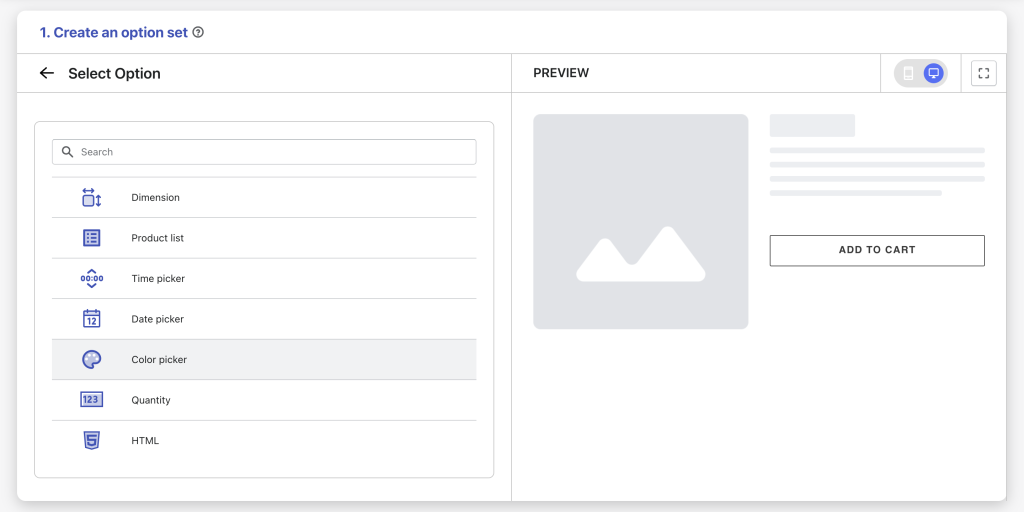
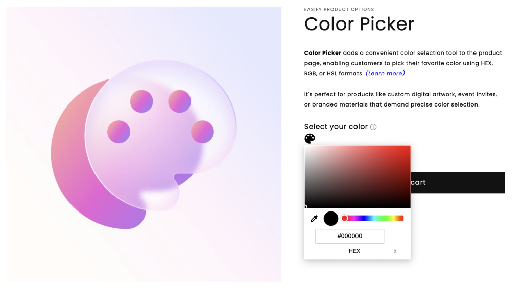
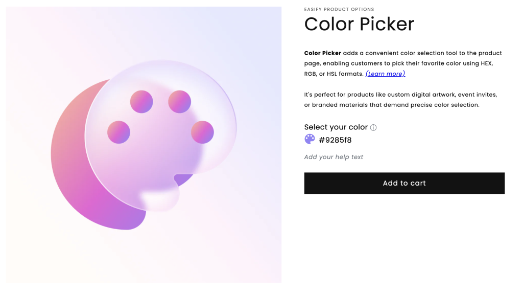
The Color Picker option type provides a user-friendly graphical interface for customers to select a color. They can choose a color by picking it directly on the color palette, or entering the color code (HEX, RGB, or HSL) for precise selection. This feature empowers customers to personalize their choices and preferences with ease.
This option type is available on the Pro and Premium plan.
Option Settings #
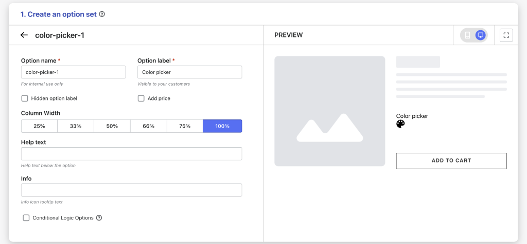
- Option name: Give your Color Picker option a unique internal name, which will also be visible to your customers. Ensure that different options in the option set have distinct names.
- Option label: Add a label that is visible to your customers such as “Select a color”. Option labels can be the same or different for various options in the option set.
- Hidden option label: Hide the option label if you want to keep the interface cleaner or prefer it not to be visible to users.
- Add price: Set a price for this option if you want to charge an extra fee for color selection.
- Column width: Adjust the width of the Color Picker option area if you want, choose from 25-33-50-66-75-100%.
- Help text: Provide additional instructions or information for customers.
- Info: Create an informative tooltip that appears when users hover over a small icon, providing more context or assistance.
- Conditional logic options: Determine the visibility of the Color Picker, ensuring it appears only when specific custom options or Shopify variants are selected. To set up the condition logic for your Color Picker, follow this guide.
Need Assistance? #
If you run into any challenges while configuring your custom options, feel free to reach out to us for assistance through our convenient in-app live chat, by submitting your request via our contact form, or by sending an email to support@tigren.com. We’re here to help!