The Product List: Tabs is a simple but powerful way to organize content into neat sections. Instead of showing everything at once, you can split products or information into tabs that shoppers can click through.
Think of Tabs like a set of folders: each tab holds its own group of items, and shoppers can move between them with a single click. This keeps your box builder clean, structured, and much easier to navigate — especially when you have a wide range of products.
1. Common Use Cases #
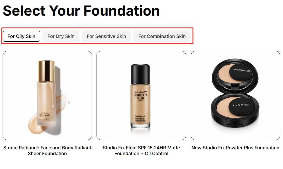
- Cosmetic/Makeup bundle: Cosmetics stores can use Product List: Tabs to organize foundation products by skin type (Oily skin, Dry skin, Sensitive skin). Customers just click the tab that matches their skin type and instantly see the right products.
- Pet toys/supplies bundle: Pet stores can organize items by animal type. Customers just click the tab for Dogs, Cats, Birds, or Fish and quickly find the products relevant to their pets.
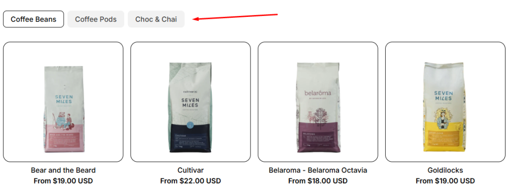
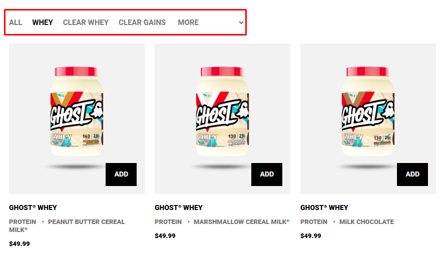
- Supplements bundle: Fitness stores usually have a large range of products, they can use Tabs to organize products by type: Whey Protein, Clear Whey or Clean Gains…
2. How to Add Product List: Tabs to Box #
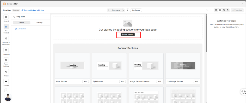
- Step 1: Click the “Add section” button
- Step 2: Select Tabs element (or Product List: Tabs).
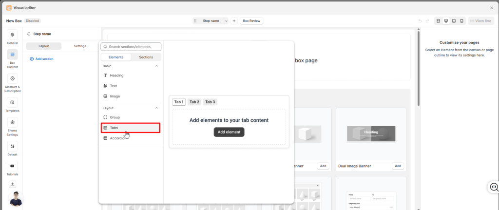
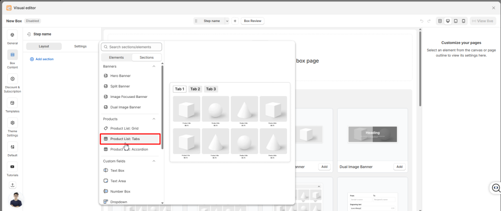
- Step 3: Add content inside each tab (e.g., product lists, images, text).
👉 Think of tabs like folders: each one holds a different set of items, and customers can switch between them with a single click.
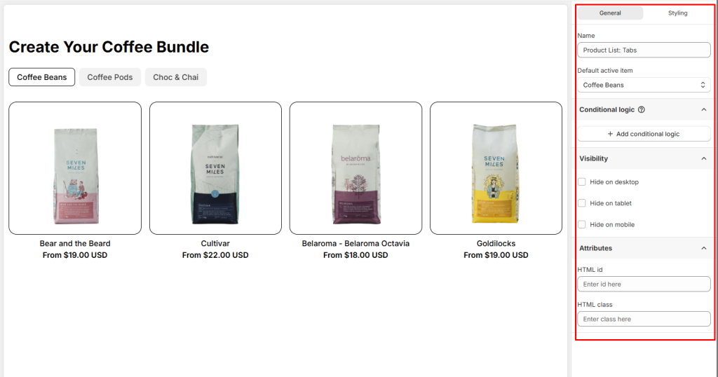
3. General Settings #
In the General tab, you’ll find options that control the overall behavior of the Tabs group:
- Tab Name: Change the display name of the whole Product List: Tabs.
- Default active item: Decide which tab will be displayed first when the page loads.
- Conditional Logic: Add rules to show or hide the Tabs group based on customer choices.
- Visibility: You can hide Tabs on Desktop, Tablet, or Mobile
- Attributes: Add custom identifiers for advanced styling or tracking
4. Styling Settings #
You can also fine‑tune the look of the Product List: Tabs from the Styling section.
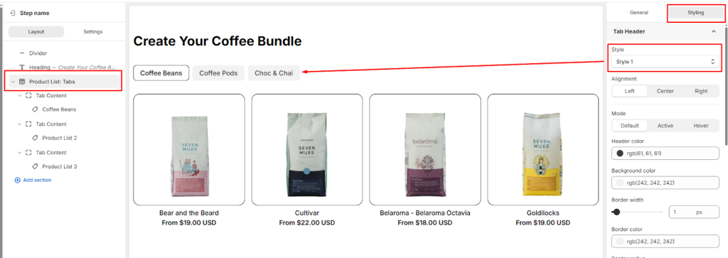
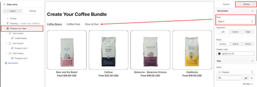
Choose between Style 1 or Style 2 for tab headers.
- Style 1
- Style 2
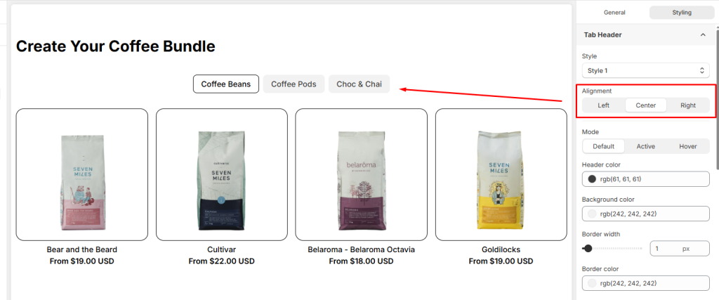
- Header Alignment: Choose how the tab titles are aligned within the header bar (Left, Center, or Right).
- Other Advanced Design Controls: You can further customize the design using a wide range of options for Size, Spacing, Background, Border, Effects, or custom CSS to ensure the Tabs element fits your page’s design perfectly.
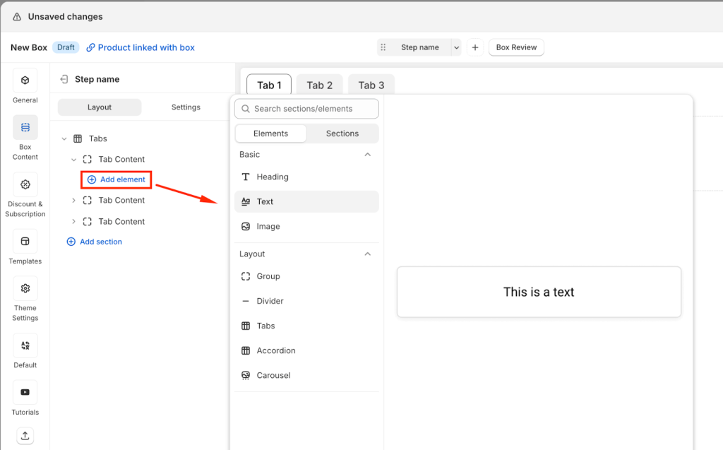
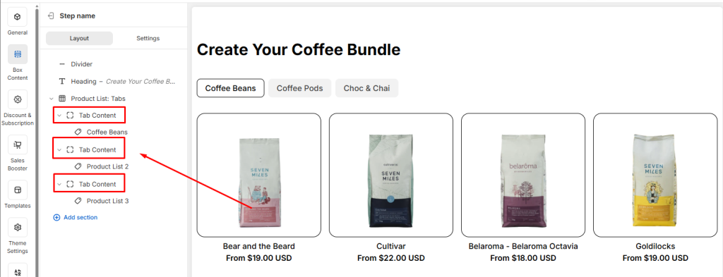
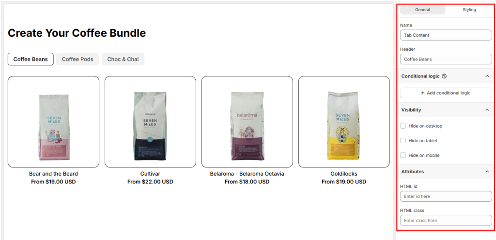
5. Tab Content #
When you use the Tabs layout, the Product List is divided into multiple tab content areas. Each tab content is essentially a smaller section inside the overall Product List. This means every tab has its own settings and can be customized independently.
To edit a tab, select the specific Tab Content from your Box Content. You can then adjust its General or Styling settings.
General Settings for Tab Content #
In the General tab, you can configure the overall behavior of each tab content.
- Name: The internal ID of the tab
- Header text: The label shown to customers on your storefront.
- Conditional Logic: Add rules to show or hide the Tab Content based on customer choices.
- Visibility: You can hide Tab Content on Desktop, Tablet, or Mobile
- Attributes: Add custom identifiers for advanced styling or tracking
Styling Settings for Tab Content #
Each tab can also be styled individually, so you can adjust layout, spacing, borders, or apply custom CSS to match your storefront design.
- Layout: When you add multiple elements inside a Tabs Content (for example: a heading, description, and product list), the Layout settings let you control how those elements are arranged. You can adjust direction (vertical or horizontal), alignment, position, and gap to create a clean and organized design.
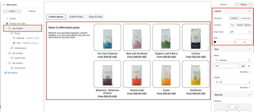
- Size: Define the width and height of the tab content
- Spacing: Adjust padding (inside spacing) and margin (outside spacing) to create balanced layouts.
- Color: Set the content color to match your storefront design.
- Background Color: Choose the background color for the tab content.
- Border: Customize the border style and border radius
- Effects: Apply opacity (transparency) and shadow.
- Custom CSS: Insert your own CSS rules for advanced styling and precise design control.
Product List in Tab Content #
When you add a Product List inside a Tab Content, it’s important to understand that at its core, this is still a Product List: Grid. The Tabs layout simply organizes multiple product lists into separate sections, but each tab’s product list is powered by the same structure and settings.
👉 Learn more about Product List: Grid
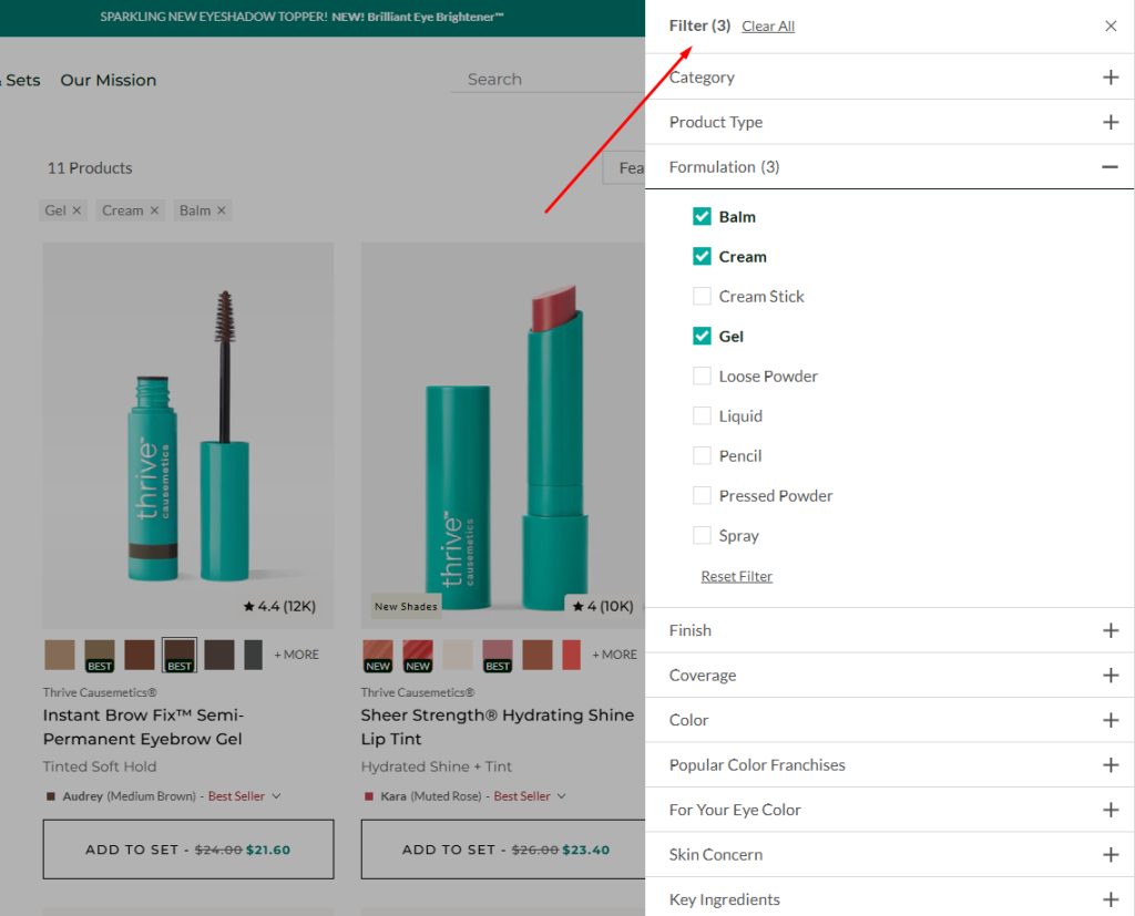
6. Tabs vs Filters #
Tabs and Filters can both be used to organize your product lists, but they serve different purposes:
- Tabs → Imagine a beauty store selling makeup products. They split products into tabs like For Oily Skin, For Dry Skin, For Sensitive Skin, For Combination Skin. Customers click each tab to see that group. Tabs are just a way to present products in separate lists.
- Filters → The same store shows one big list of beauty products. Customers can tick multiple filters like Skin Type: Oily, Formulation: Balm + Cream + Gel, Coverage: Full. The list is narrowed down to only products that match those filters. Filters let customers refine results inside one product list.
👉 Use Tabs when you want to emphasize distinct groups of products in a product list.
👉 Use Filters when you want customers to fine‑tune results within the same product list.
💬 Need Help? #
If you run into any issues or have questions, feel free to reach out via our in-app 24/7 live chat. We’re always here to help!