The Accordion Element enables you to present content in collapsible sections. This helps streamline your pages, improve the user experience, and can lead to higher conversion rates.
👉 Instead of overwhelming customers with long lists, Accordion breaks content into digestible chunks that shoppers can open only when they need them.
1. Common Use Cases #
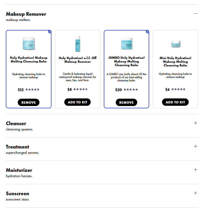
- Skincare bundle: Organize products by routine steps, using accordion (e.g., Makeup Remover, Cleanser, Treatment, Serum, Moisturizer)
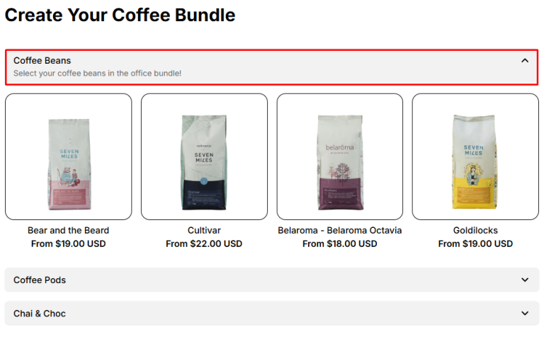
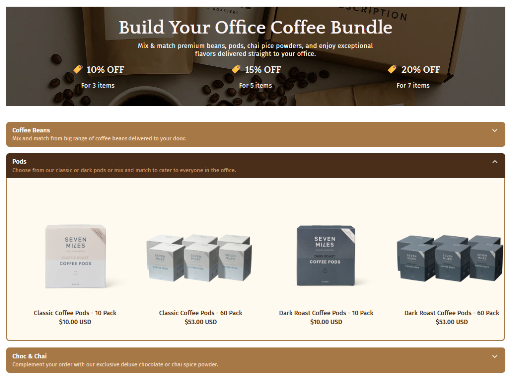
- Coffee bundle: Coffee merchants can use Product List: Accordion to organize products by type (Coffee beans, Coffee pods, Specialty blends)
2. How To Add Accordion Element #
- Step 1: Click the “Add section” button
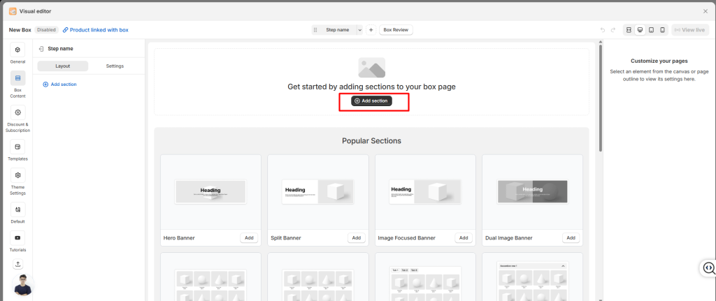
- Step 2: Choose the Accordion element or Product List: Accordion section
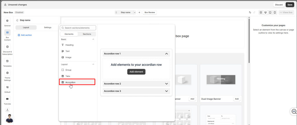
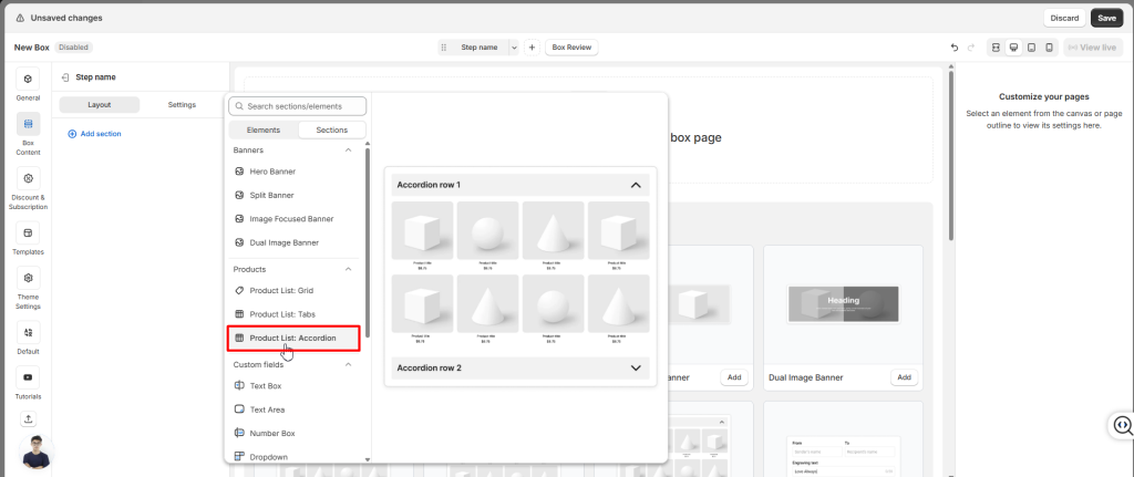
- Step 3: Add content inside each accordion (e.g., product lists, images, text).
You can configure the Accordion Element’s settings and appearance using the options in General and Styling.
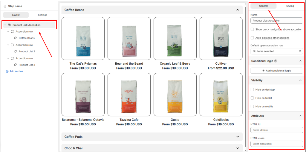
2. General Settings #
In the General tab, you’ll find options that control how the accordion behaves:
- Show quick navigation above accordion: Show a row of buttons above the accordion. When customers click a button, the page automatically scrolls to that section below.
- Auto-collapse other sections: Automatically collapse other accordion sections when one is expanded, keeping only one section open at a time.
- Default open accordion row: Pick which section should be open by default when the page loads
- Conditional Logic: Add rules to show or hide the Accordion based on customer choices.
- Visibility: You can hide Accordion on Desktop, Tablet, or Mobile
- Attributes: Add custom identifiers for advanced styling or tracking
3. Styling Settings #
Want to make your accordion match your store’s look? Head to the Styling tab.
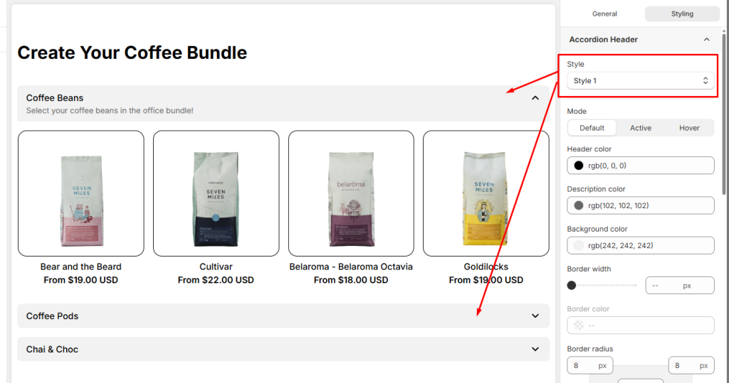
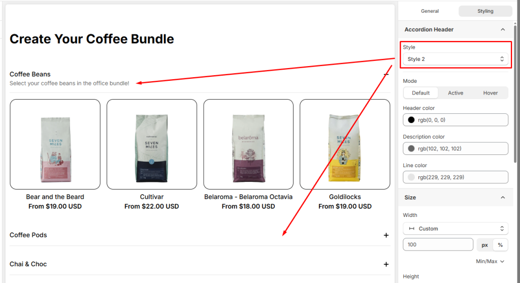
For Accordion Header Styling, customize the appearance of your accordion headers by styling their two different states.
- Style 1
- Style 2
- Advanced Design Controls: You can further customize the design using a wide range of options for Size, Spacing, Background, Border, Effects, or custom CSS to ensure the Accordion element fits your page’s design perfectly.
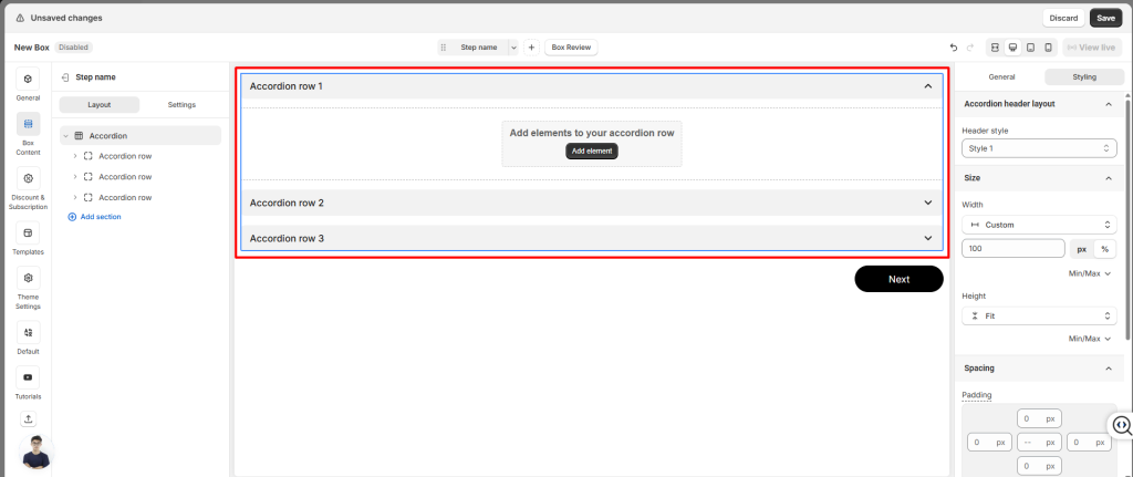
4. Accordion Row #
When you use the Accordion layout, the Product List is divided into multiple Accordion Row. Each row is essentially a smaller section inside the overall Product List. This means every row has its own settings and can be customized independently.
To edit one, select the row from Box Content.
General Settings for Accordion Row #
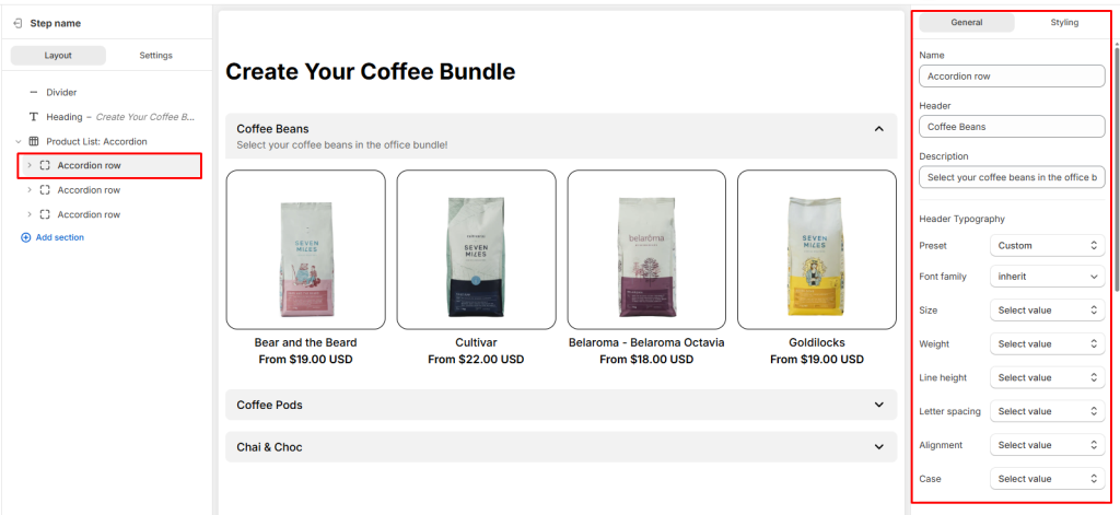
- Name: The internal ID of the row
- Header text: The label shown to customers on your storefront.
- Description: The main content that appears directly below the header.
- Header Typography: Where you can customize the header text styles.
- Description Typography: Where you can customize the description text styles.
- Conditional Logic: Add rules to show or hide the Accordion row based on customer choices.
- Visibility: You can hide Accordion row Desktop, Tablet, or Mobile
- Attributes: Add custom identifiers for advanced styling or tracking
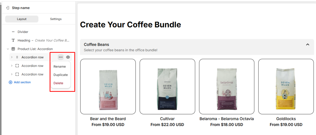
You can also manage rows easily: add new rows, rename, duplicate, delete, or hide them using the buttons next to each row.
Styling Settings for Accordion Row #
Each Accordion Row can also be styled individually, so you can adjust layout, spacing, borders, or apply custom CSS to match your storefront design.
- Layout: When you add multiple elements inside a Accordion Row (for example: a heading, description, and product list), the Layout settings let you control how those elements are arranged. You can adjust direction (vertical or horizontal), alignment, position, and gap to create a clean and organized design.
- Size: Define the width and height of the tab content
- Spacing: Adjust padding (inside spacing) and margin (outside spacing) to create balanced layouts.
- Color: Set the content color to match your storefront design.
- Background Color: Choose the background color for the tab content.
- Border: Customize the border style and border radius
- Effects: Apply opacity (transparency) and shadow.
- Custom CSS: Insert your own CSS rules for advanced styling and precise design control.
Product List in Accordion Row #
When you add a Product List inside a Accordion Row, it’s important to understand that at its core, this is still a Product List: Grid. The Accordion layout simply organizes multiple product lists into separate sections, but each tab’s product list is powered by the same structure and settings.
👉 Learn more about Product List: Grid
💬 Need Help? #
If you run into any issues or have questions, feel free to reach out via our in-app 24/7 live chat. We’re always here to help!