- 🎯 Why Use a Template?
- 🔧 How to Set Up a New Box Using a Template
- 💬 Need Assistance?
Whether you’re selling gift boxes, meal combos, or curated bundles, the Visual Editor lets you build the layout, flow, design, and discount rules — all in one place.
This guide will walk you step-by-step through using the Visual Editor with ready-to-use templates to speed up your setup process, even if you’re not a designer or tech expert.
🎯 Why Use a Template? #
Templates give you a fast and flexible starting point. Each template is pre-designed with a layout and content based on real-world use cases – so you can:
- Visualize how your box flow will look
- Save time on setup
- Easily customize to fit your exact needs
🔧 How to Set Up a New Box Using a Template #
A. Select Box Type and Template #
Step 1: Choose your box type: #
You’ll see 4 types of box setups. Each works differently and supports different discount methods.
- Regular Box
- Fixed Box Price
- Tiered Quantity Discounts
- Predefined Box Sizes
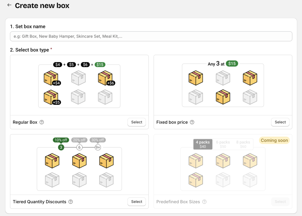
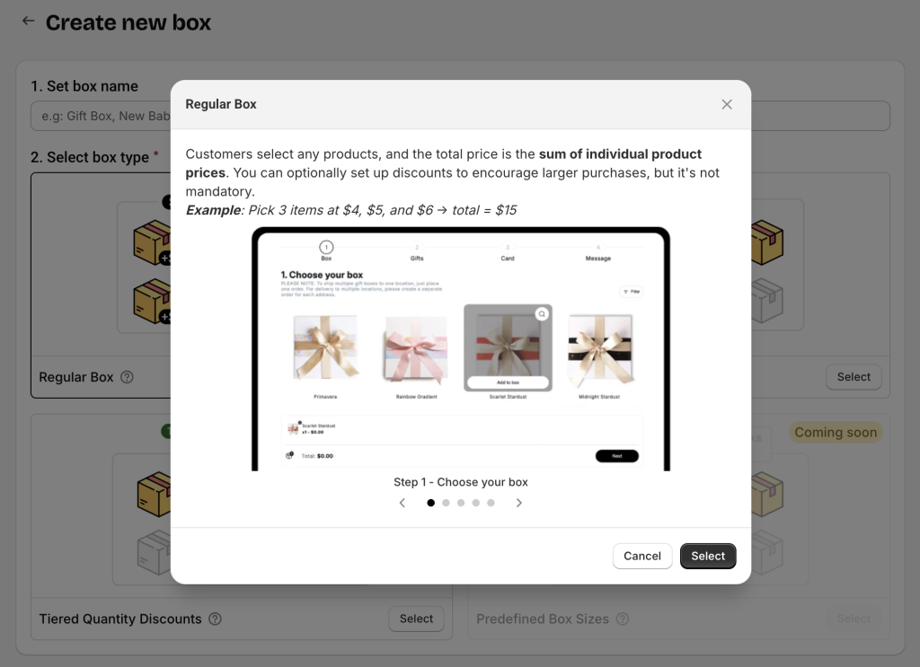
💡 Click the tooltip icon (question mark) next to each box type name to open a popup with detailed explanations and examples before selecting.
After choosing your box type, the app will show all available templates for that type.
Step 2: Select a template #
Once you choose a box type, you’ll see a list of templates designed for it. You can:
- Click the eye icon to preview any template before choosing.
- Use layout filters to narrow your choices:
- One-page layout: All actions (product selection, entering custom fields, etc.) happen on a single page. Note: One-page layout doesn’t mean your box has only one step – you can still add multiple steps, but they’ll all be shown together in one interface – without a step bar.
- Multi-page layout: Each step appears on its own page. Customers click Next/Back to move through the box-building flow.
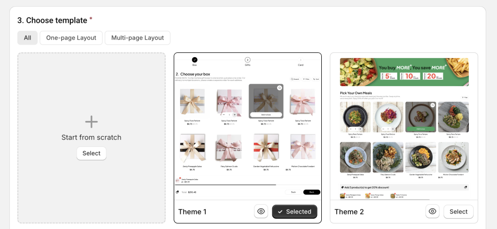
Click Start building to open the Visual Editor and begin customizing your selected template.
B. Customize the Template #
🔔 Using templates may take a short learning curve, especially for non-tech users. But once you understand the basics, you’ll find it both easy and powerful.
And remember – anytime you get stuck, just open the live chat in the bottom-left corner. We’re always here to help.
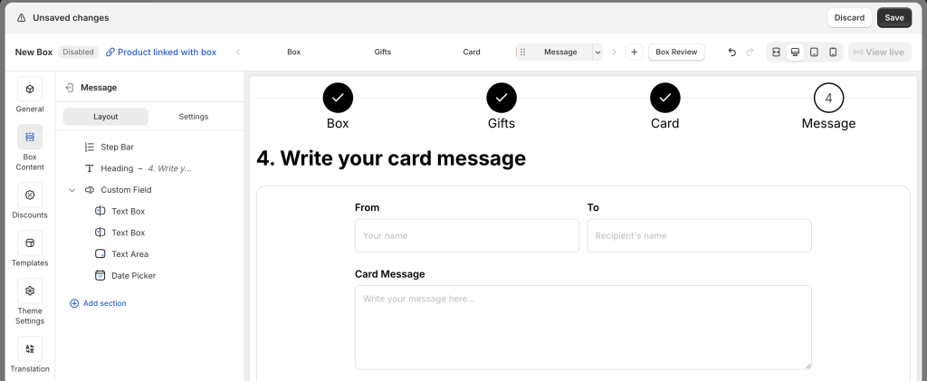
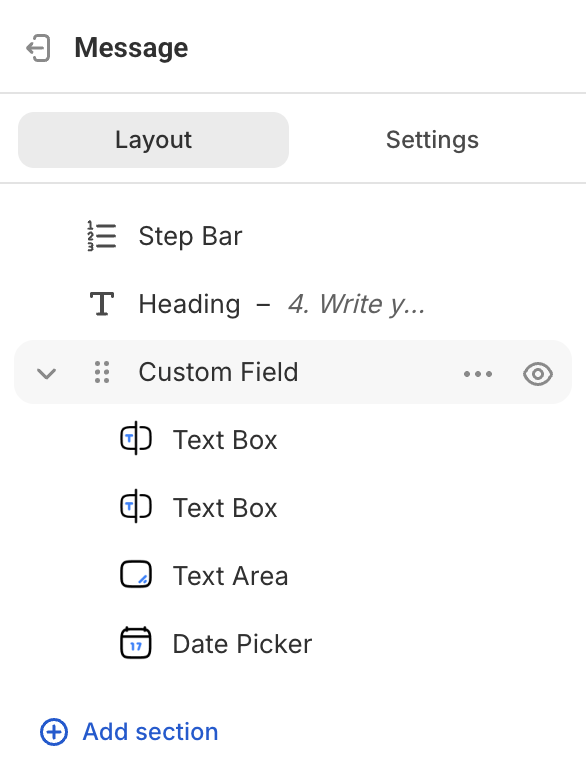
Step 1: Review and Adjust the Steps #
Each template includes a series of steps (e.g., Box > Gifts > Card > Message). You can:
- Remove steps that don’t match your flow
- Duplicate steps if you need similar ones
- Create new steps from scratch if needed
- Reorder steps by dragging them into the desired sequence
Once your steps are set, move on to configuring each step’s details.
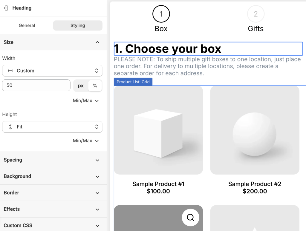
Step 2: Edit Page Structure and Content
Depending on your screen size, you’ll see either:
- Single-column mode (0n small screens): Click an element or section to edit → then click Back to return to the page structure tree.
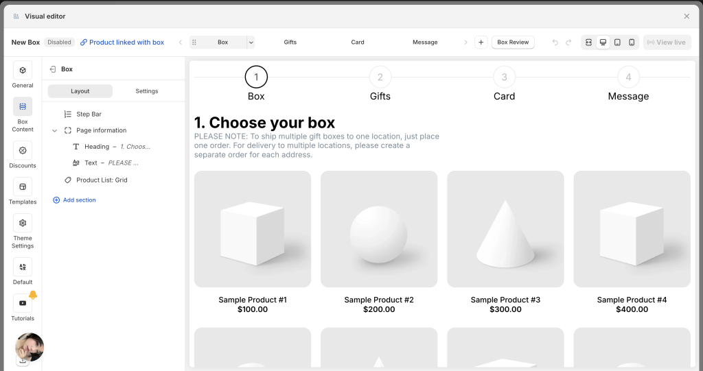
- Dual-column mode (on large screens): Page structure on the left, settings panel on the right.
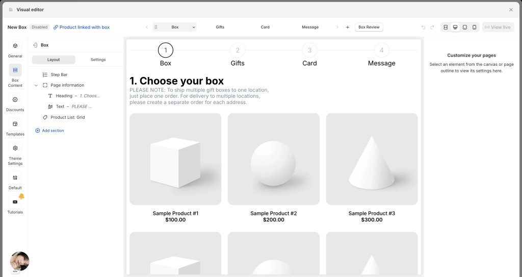
You can click:
- Any section or element in the page structure tree
- Or directly on the preview page
To open the settings panel for that element.
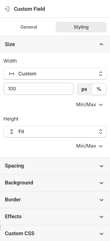
Each section/ element has 2 tabs:
- General tab – Edit content (text, products, fields, etc.)
- Styling tab – Adjust appearance (size, color, padding, margins, etc.)
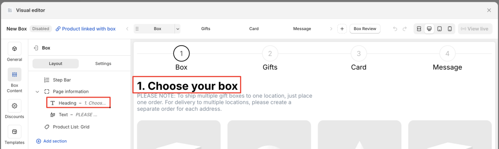
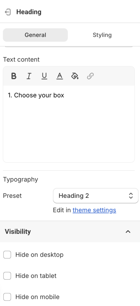
📝 Editing Headings & Text
Click on the heading or text block to change the default content.
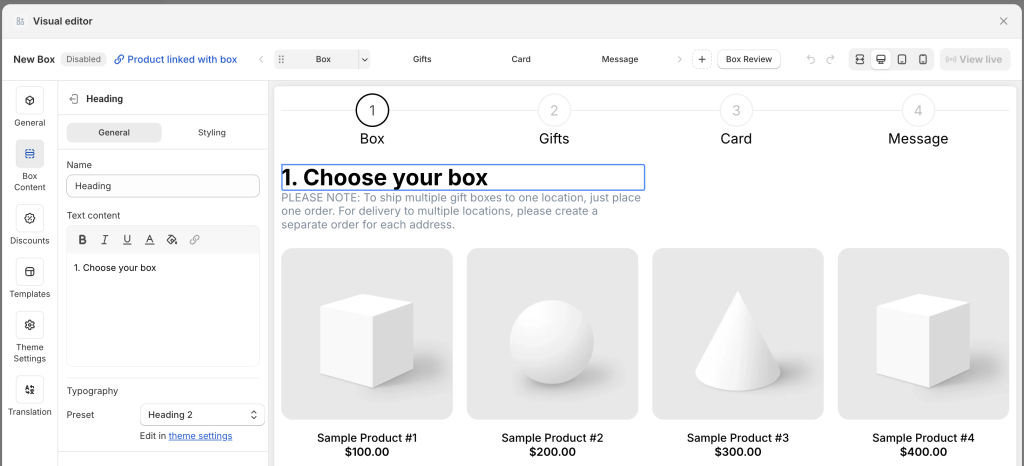
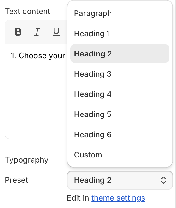
For font and style, you have 2 options:
- Use Preset Headings & Paragraph: Change from the default preset (e.g., Heading 1) to another (e.g., Heading 2–6 or Paragraph). Each preset uses the default styles set in Theme Settings. To adjust these styles globally, go to Theme Settings.
- Use “Custom“: Choose “Custom” in the Preset field to unlock all styling settings. Changes will apply only to this element — not globally.
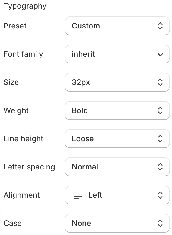
- To change design properties such as width, height, padding, margin, background, border, etc., open the Styling tab.
Note: If the Heading and Text are grouped together — such as in the Page Information group — you may need to adjust the styling for both the group container and each individual element (Heading & Text) to achieve the desired result. That’s because the element’s styling is affected by the group’s styling.
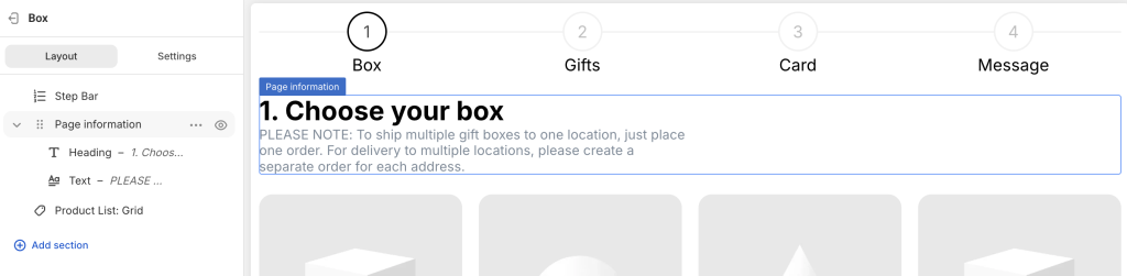
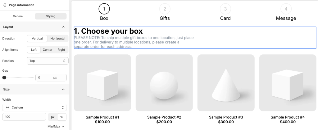
📦 Product List
Templates only display dummy products to help you visualize the layout. You’ll need to add your actual products.
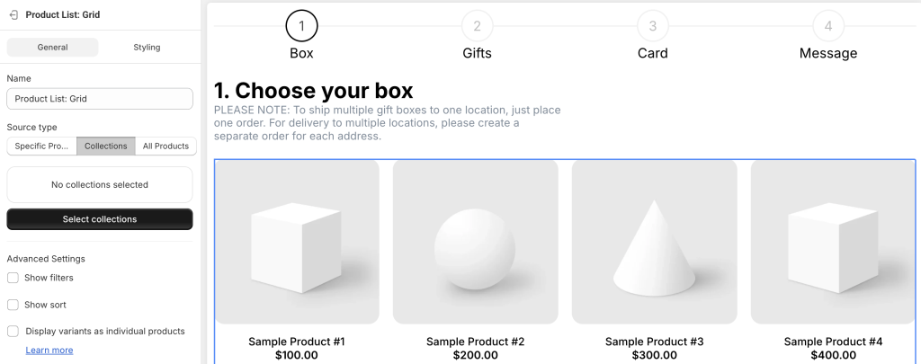
To replace them:
- Click the product list section (in the layout tree or preview)
- In the General tab, choose your Source type:
In the General tab, choose a Source type:
- Specific Products: Select individual products. Supports Search and Sort. (No Filter)
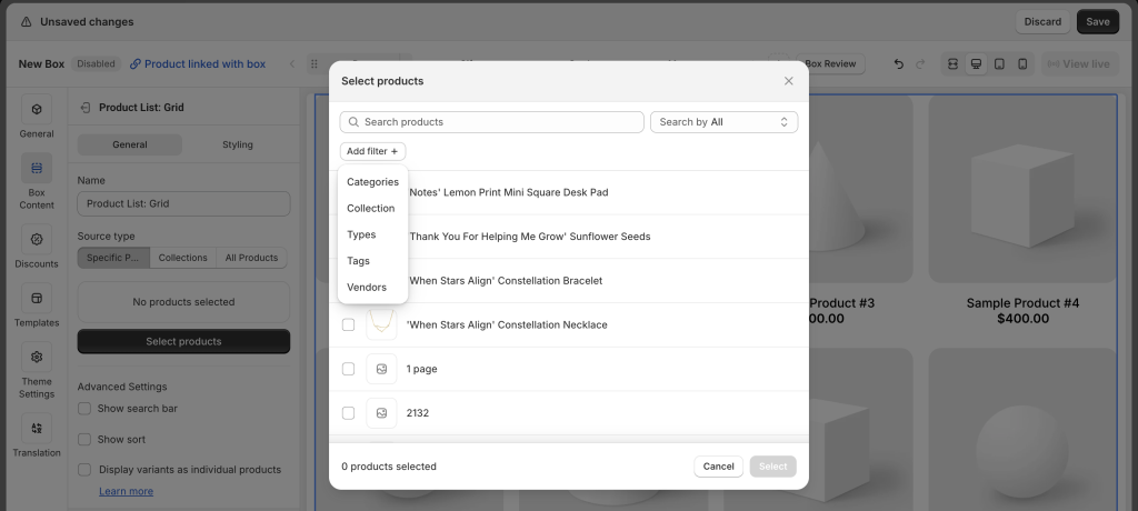
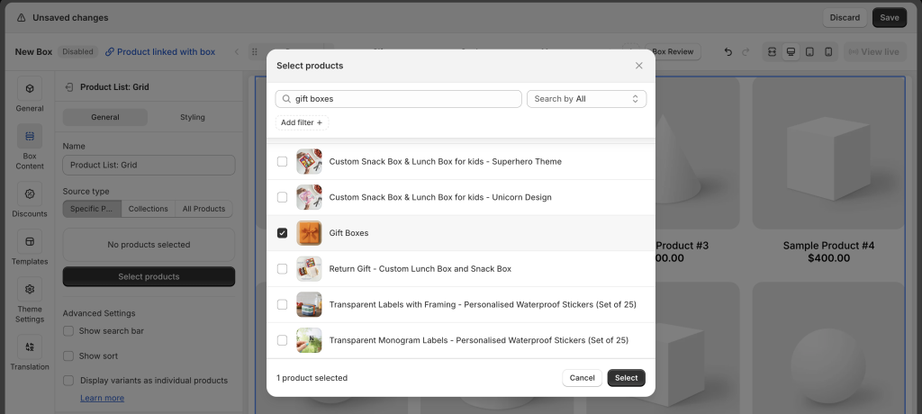
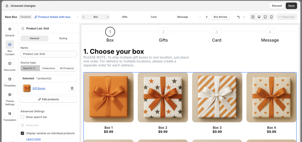
- Collections: Add one or more collections. Supports Sort (only if one collection selected) and Filter. (No Search)
- All Products: Displays all products in your store. Supports Search and Sort. (No Filter)
🔤 Custom fields
Some templates come with built-in custom fields.
Click each custom field option to edit its name, label, help text, tooltip, placeholder, etc.
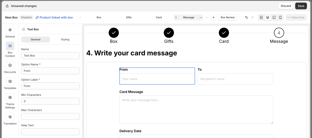
Once done editing individual options, click on the entire Custom Field section, go to the Styling tab, and adjust the section’s size, padding, border, and more.
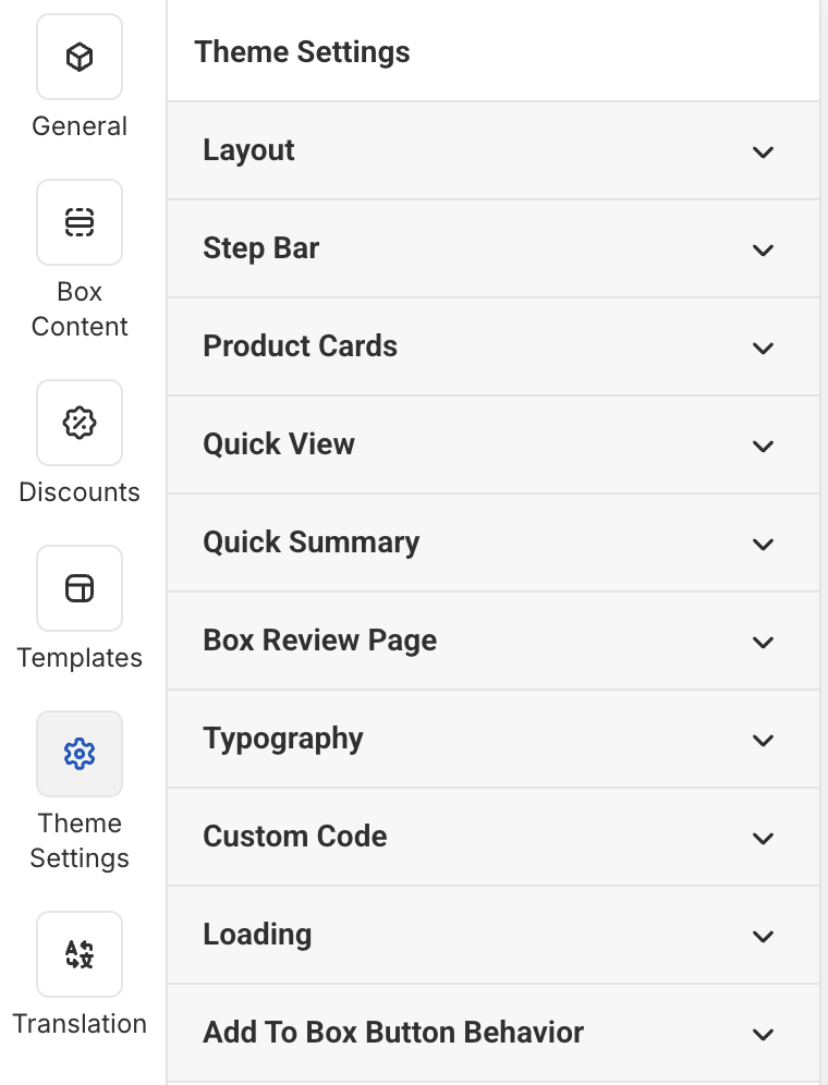
3. Update Global Styles in Theme Settings #
Click Theme Settings in the Visual Editor’s top menu to adjust overall design:
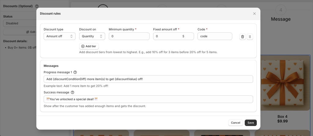
4. Set Up Discounts (Optional) #
🔔 Discount settings vary depending on your selected box type.
To configure:
- Go to the Discounts tab
- Change Status to Enabled
- Click Edit Rules to open the discount setup popup
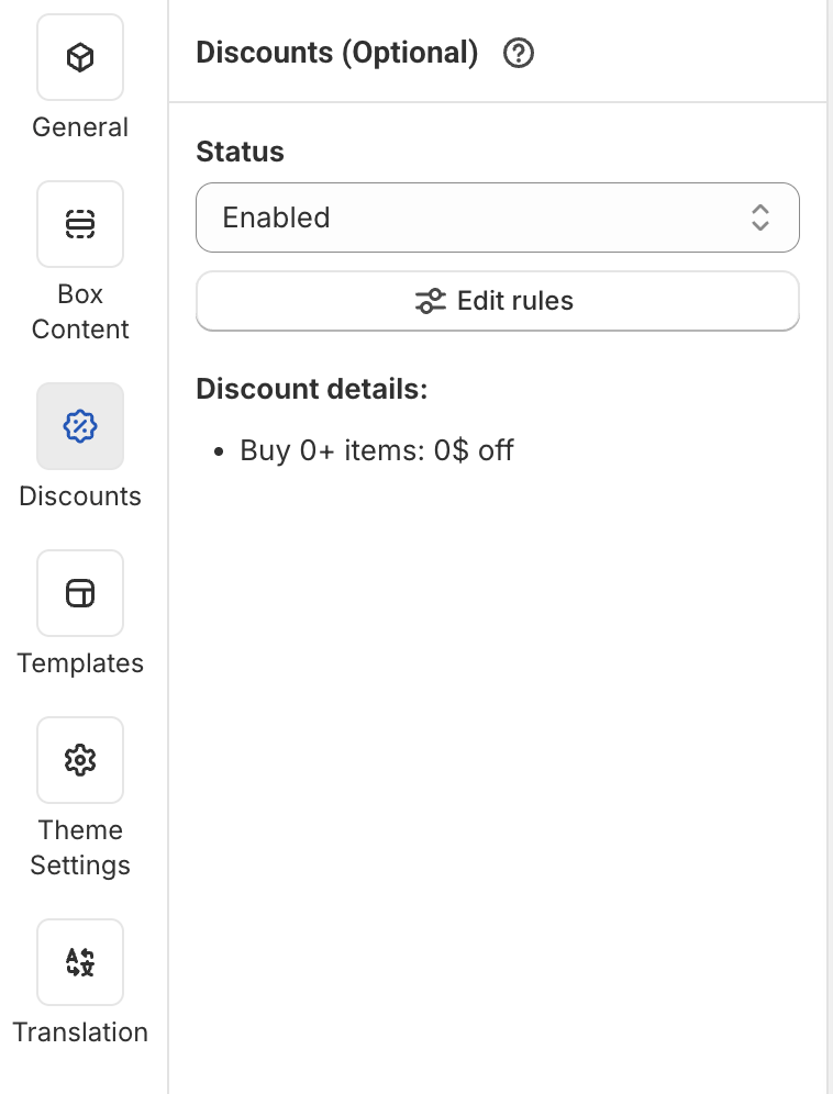
- Set up your discount logic as needed
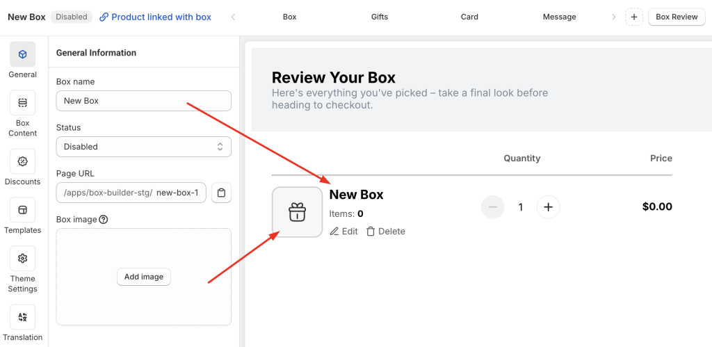
5. Update Box Information #
Go to the General tab and fill in:
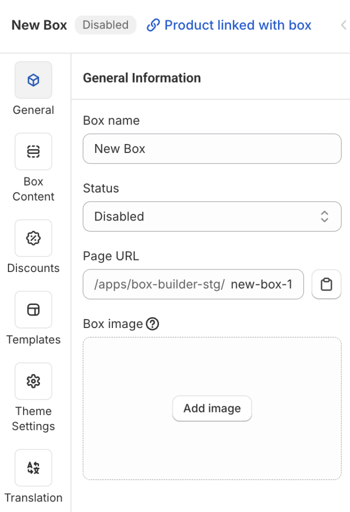
- Box name: Visible on Box Review Page, Cart, Checkout, and also used as the name of the auto-generated product linked to this box.
- Status: Set it to Enabled (default is Disabled) to publish your box.
- Page URL: Enter a unique handle (e.g.,
build-your-own-box), like any other store page URL. - Box image: Upload a square image. This will be shown on Box Review Page, Cart, Checkout, and also used as the featured image of the linked product. Non-square images will be automatically cropped.
6. Check the Box Design on Different Devices #
In the top-right corner of the Visual Editor, you’ll see the view mode switcher: Fullscreen, Desktop, Table, and Mobile.

Use this to preview how your box page looks on each device and make improvements as needed.
Each element or section has a Visibility setting in the General tab.
You can choose to show or hide that element on specific devices.
This is useful when you want to hide certain elements on mobile for a better experience.
7. Publish the Box Page #
When everything is set:
- In the General tab, change Status from Disabled → Enabled
- Click Save
You’ll now see a “View Live” button (disabled by default, enabled after you enable and save the box).
Clicking it will open your live box page on your storefront for final review.
💬 Need Assistance? #
We’re here to help—24/7!
Just click the live chat in the bottom-left corner of the app to get support at any time.