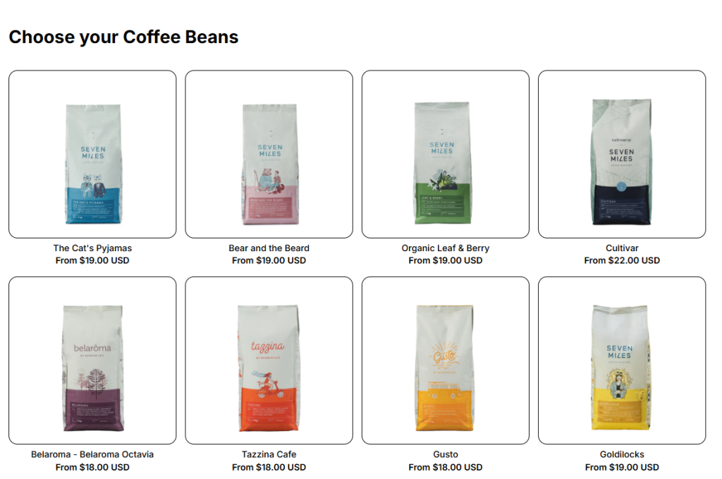
The Product List: Grid is the most common way merchants display products in their store. It lays items out in a simple grid format, making it easy for customers to browse, compare, and add products to their cart.
💡The Product List: Grid is the foundation of all product list layouts in Easify Box Builder. Whether you choose Grid, Carousel, Tabs, or Accordion, each layout is powered by the same product list settings.
1. How to Add a Product List: Grid #
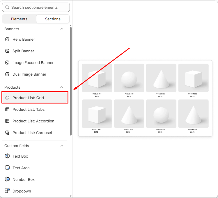
- Click Add Section → Choose Product List: Grid.
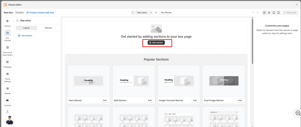
- Select the product list in your layout.
Once added, you can adjust how the list looks and behaves using the settings below.
2. General Settings #
In the General tab, you’ll configure the basics:
- Name: Give your product list an internal name so you can recognize it later.
- Layout Type: Choose between Grid layout or Carousel layout (Carousel uses the same settings but displays products in a slider format.)
- Source Type: Decide what products to show:
- Specific Products: Hand‑pick items.
- Collections: Pull products from a Shopify collection.
- All Products: Display your entire catalog.
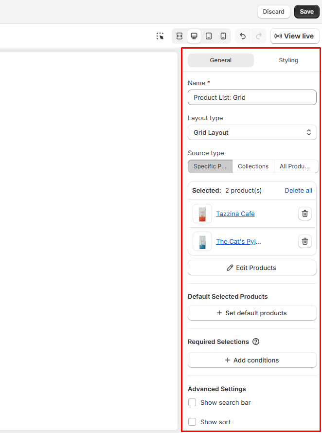
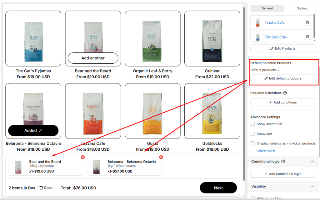
Default Selected Products #
You can pre‑select certain products in the product list so they’re automatically added to the box from the start. This helps customers build their bundles faster, since some items are already included.
Shoppers still stay in control: they can remove or swap out the defaults anytime.
👉 Learn more in our guide to Default Selected Products
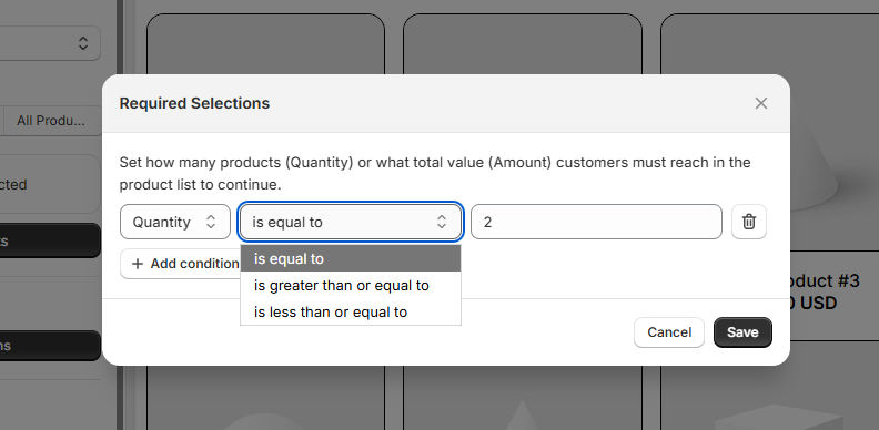
Required Selections #
Control purchase requirements before customers can proceed: You can set rules that determine how many products or what total value customers must reach in their box before moving forward.
Example: A Coffee Office Bundle Box might require at least 2 coffee beans and 2 coffee pods.
- If customers don’t meet the requirement, they’ll be prompted to add more before continuing.
- Requirements can be based on either:
- Quantity (number of products)
- Amount (total value of products)
- You can define conditions using:
- is equal to
- is greater than or equal to
- is less than or equal to
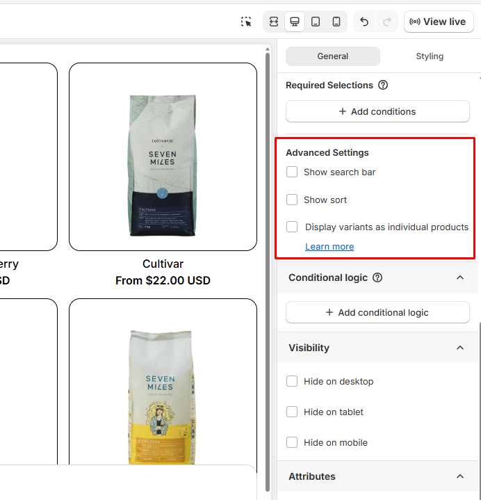
Advanced Settings #
Using Advanced Settings, you can fine‑tune the shopping experience with extra options:
- Show Search Bar: Add a search box so customers can quickly find products within the list. You can position the search bar on the Left or Right.
- Show Sort: Let shoppers sort items (for example, by price or name). You can position the sort tool on the Left or Right. By default, sorting follows your store’s filter settings, but you can customize it further using the Shopify Search & Discovery app.
- Display Variants as Individual Products: Instead of showing one product with multiple variants (like sizes or colors), you can display each variant as its own product. This makes it easier for customers to pick exactly what they want.
Visibility #
Choose where the product list appears. This is useful if you want different layouts for different devices:
- Hide on Desktop
- Hide on Tablet
- Hide on Mobile
Attributes #
For advanced users, you can add custom identifiers:
- HTML ID: Assign a unique ID for styling or tracking.
- HTML Class: Add classes for custom CSS styling.
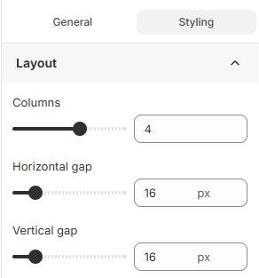
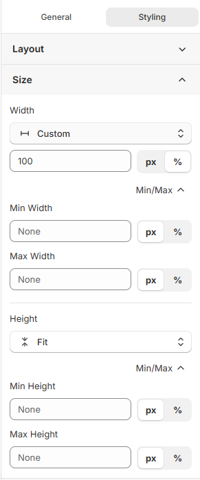
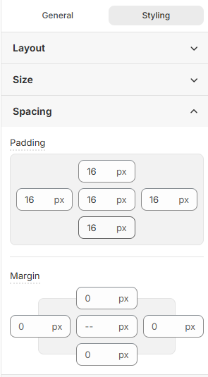
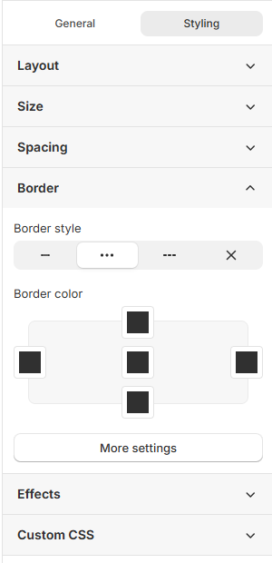
3. Styling Settings #
Use the Styling tab to control how your product list looks on the storefront.
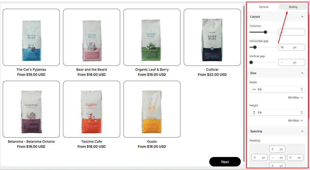
You can configure:
- Product list layout: Configure how products are arranged
- Product list size: Set the width and height of each product card
- Spacing: Adjust spacing, gaps in product list
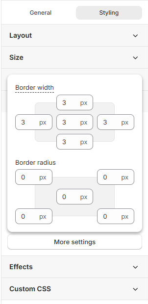
- Border: Add or customize border styles, border colors an also border width and border radius.
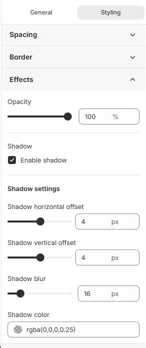
- Effects: Apply visual effects like opacity and shadows
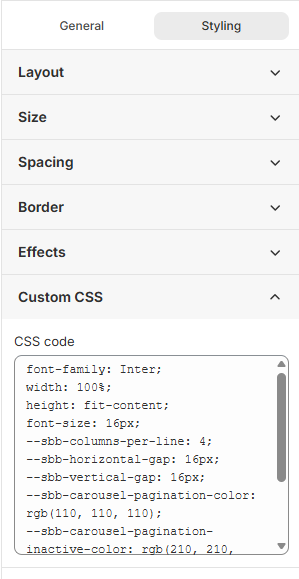
- Custom CSS: Add your own CSS classes for advanced styling control
💬 Need Help? #
If you run into any issues or have questions, feel free to reach out via our in-app 24/7 live chat. We’re always here to help!