If you don’t find any ready-made template in the app that fits your needs, or you want to design something unique for your store, then creating a new box from scratch is the way to go.
A. Select Box Type #
You’ll see 4 types of box setups. Each works differently and supports different discount methods.
- Regular Box
- Fixed Box Price
- Tiered Quantity Discounts
- Predefined Box Sizes
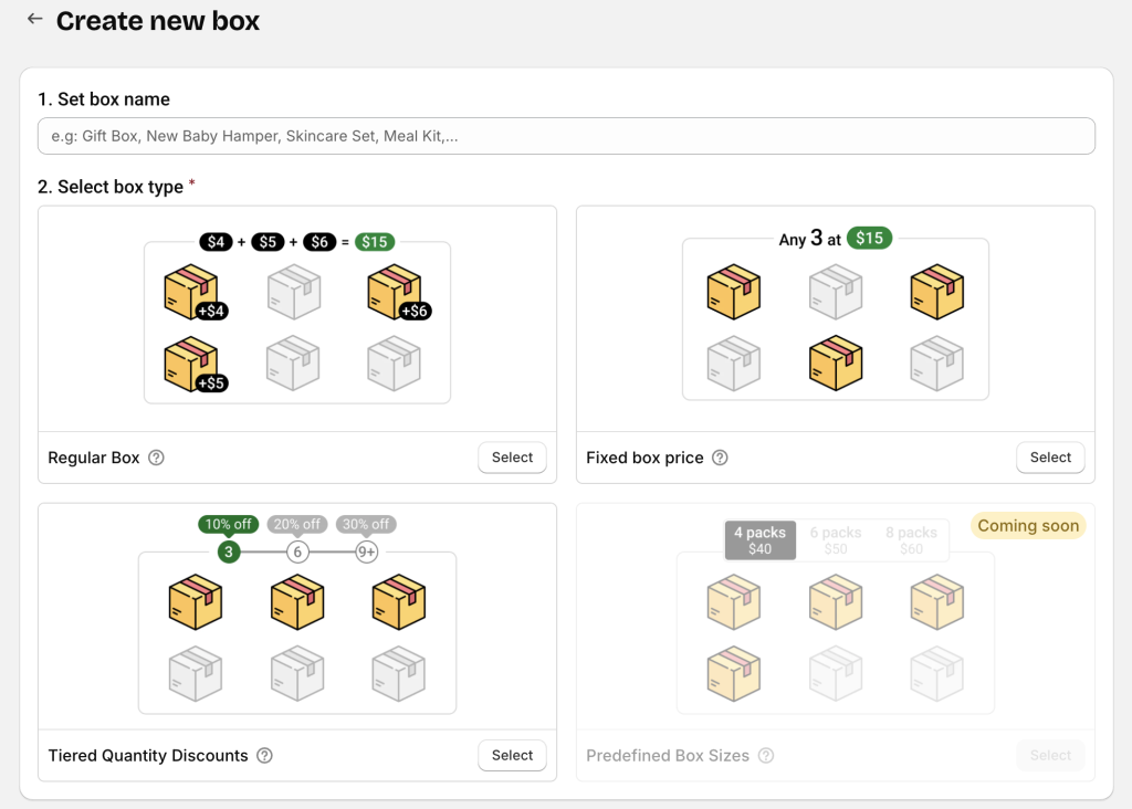
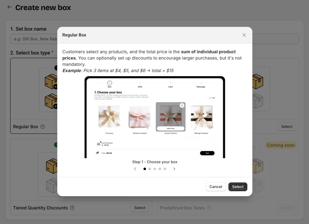
💡 Click the tooltip icon (question mark) next to each box type name to open a popup with detailed explanations and examples before selecting.
After selecting your box type, the app will display all available templates for it.
Since you’re building from scratch, select Start from scratch.
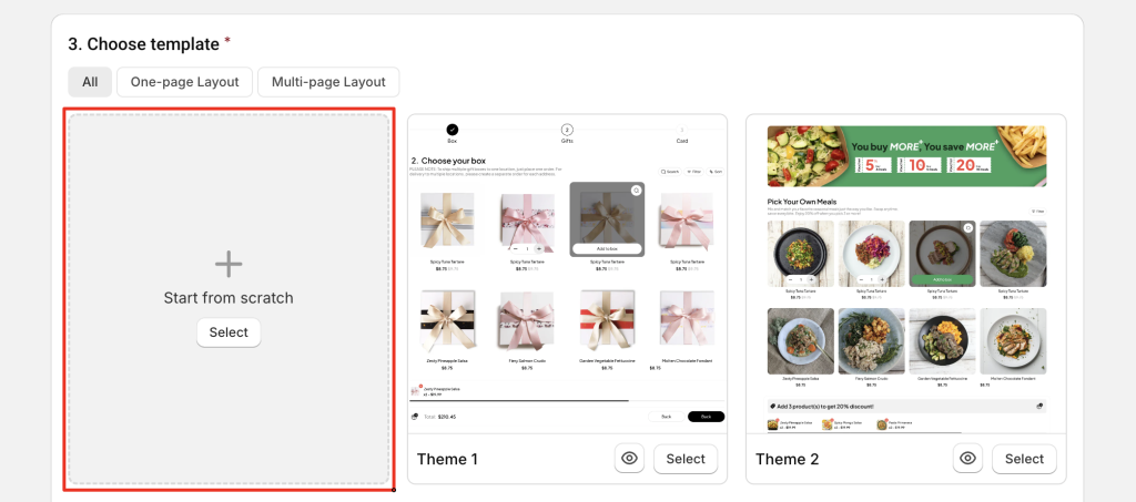
Click Start building to open the Visual Editor and begin customizing your box page.
B. Customize Your Box Page #
Depending on your screen size, you’ll see either:
- Single-column mode (0n small screens): Click an element or section to edit → then click Back to return to the page structure tree.
- Dual-column mode (on large screens): Page structure on the left, settings panel on the right.
Notes:
If your box has multiple steps, creating the first step is important because it can serve as the base structure and style for other steps (you can duplicate it to create more steps quickly).
If your box has only one step, you can ignore the “step” concept and simply build your page.
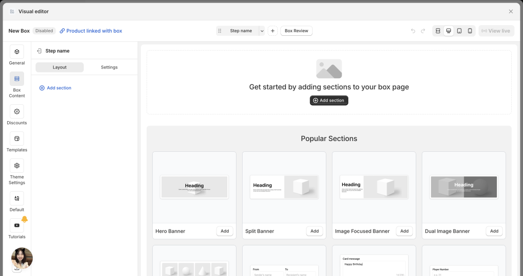
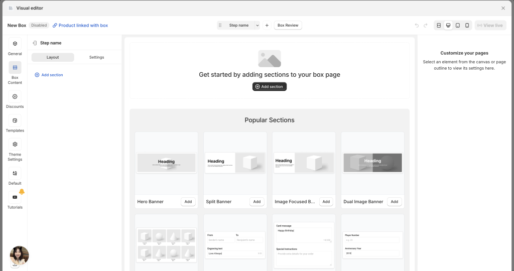
Step/Page Structure #
Each step/page will include 2 tabs:
- Layout: Lists all sections and elements in your page structure. You can move, rename, duplicate, hide, or reorder them.
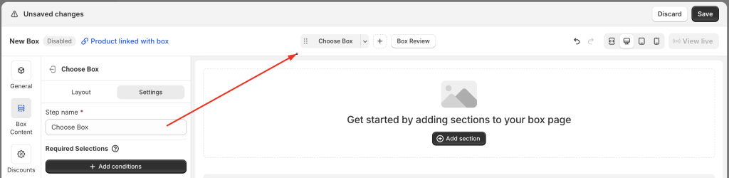
- Settings: Includes step-specific settings:
- Step name (used internally in the Visual Editor navigation, and shown in the Step Bar to customers if you use a multi-page layout)
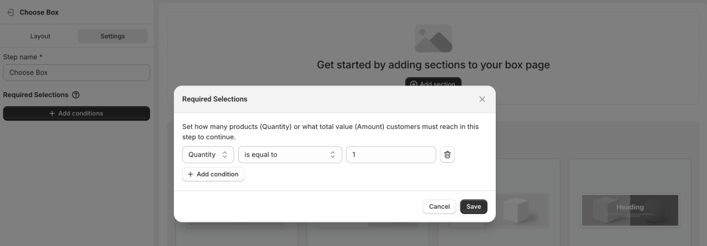
- Required Selections – Set how many products (quantity) or what total value (amount) customers must reach in this step before continuing.
Example:
In a gift box selection step, if you want customers to select exactly 1 product to proceed, set the condition to Quantity = 1.
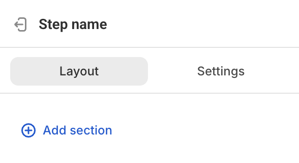
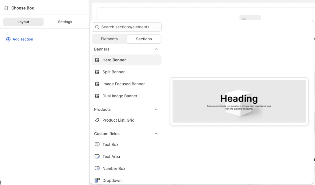
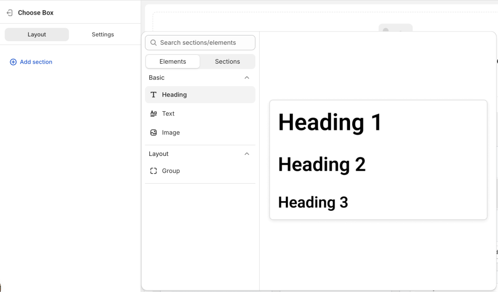
Add Sections & Elements #
Start adding content to your page by clicking Add section — either from the page layout tree or directly in the preview.
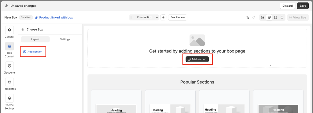
You’ll see:
- Sections – Groups of elements (e.g., Banners, Products, Custom Fields)
- Elements – Individual items (e.g., Heading, Text, Image)
Hover over an item to see a preview on the right, then click to add it to your page.
You can add all your sections/elements first to create an overall layout, then edit each one later.
Example of common sections:
- Split Banner
- Product List: Grid
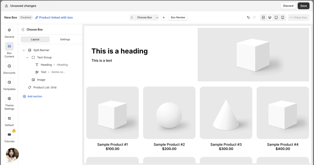
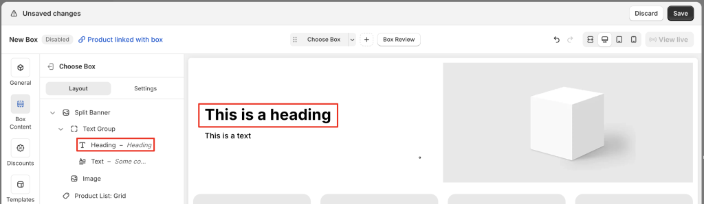
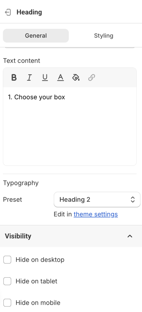
1. 📝 Editing Banner – Heading, Text, Image
A banner section usually contains a heading, text, and an image.
Click on the each element to change the default content.
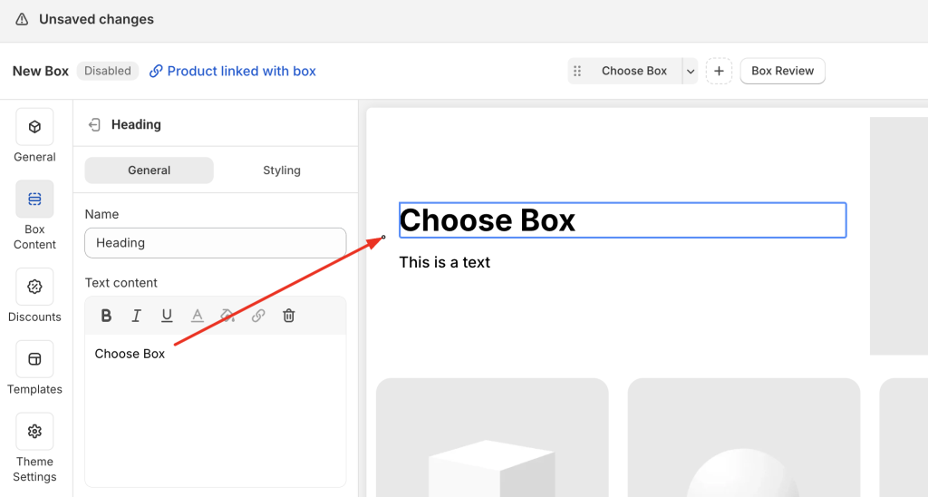
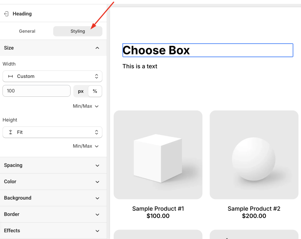
Heading & Text styling options:
- Preset Headings & Paragraph: Change from the default preset (e.g., Heading 1) to another (e.g., Heading 2–6 or Paragraph). Each preset uses the default styles set in Theme Settings. To adjust these styles globally, go to Theme Settings.
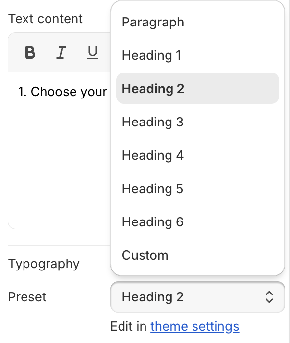
- Custom: Choose “Custom” in the Preset field to unlock all styling settings. Changes will apply only to this element — not globally.
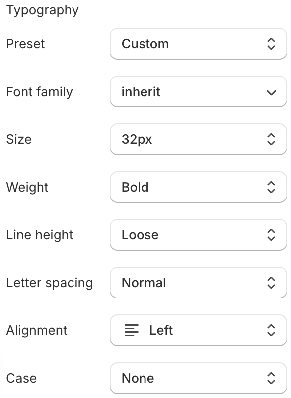
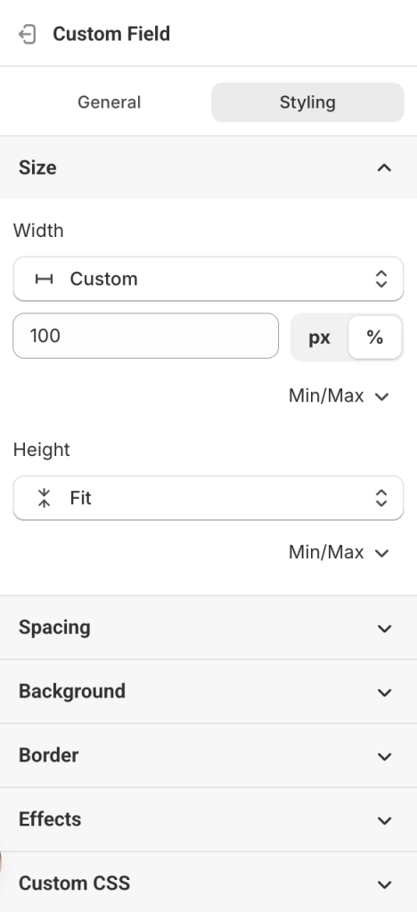
- To change design properties such as width, height, padding, margin, background, border, etc., open the Styling tab.
Note:
If Heading and Text are grouped together (e.g., in a “Text Group” under a “Split Banner” group), you may need to adjust both the group’s styling and the individual element’s styling, since group settings can override element settings.
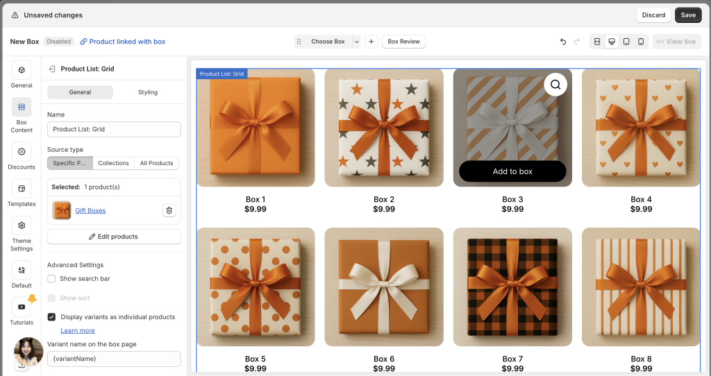
3. 📦 Add Products
The added Product list section contains dummy products to help you visualize the layout. You’ll need to add your actual products.
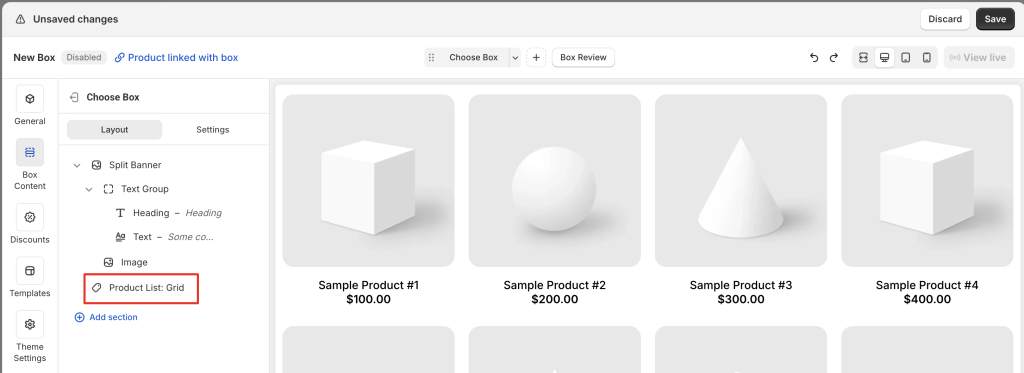
To add your products:
- Click the product list section (in the layout tree or preview)
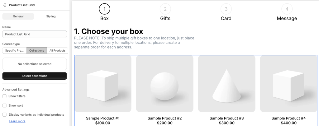
- In the General tab, choose your Source type:
In the General tab, choose a Source type:
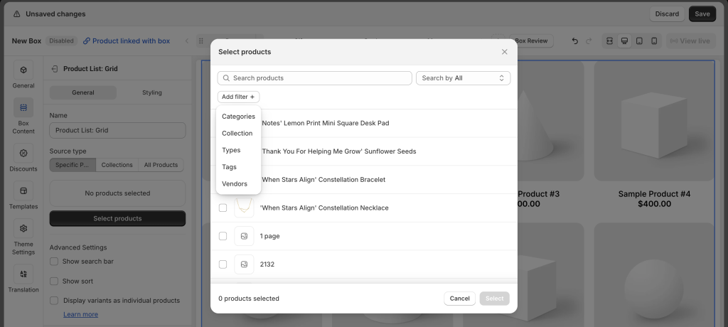
- Specific Products: Select individual products. Supports Search and Sort. (No Filter)
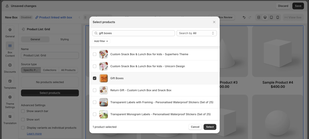
- Collections: Add one or more collections. Supports Sort (only if one collection selected) and Filter. (No Search)
- All Products: Displays all products in your store. Supports Search and Sort. (No Filter)
4. 🔤 Add Custom fields (Optional)
If your products require personalization, custom fields let you collect extra information from customers.
Example: For a greeting card, add text fields so customers can enter their message.
The app offers 12 field types:
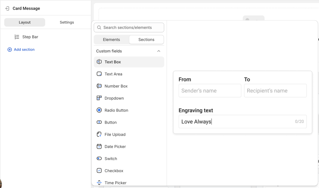
- Text Box
- Text Area
- Number Box
- Dropdown
- Radio Button
- Button
- File Upload
- Date Picker
- Time Picker
- Switch
- Checkbox
- Image Swatch
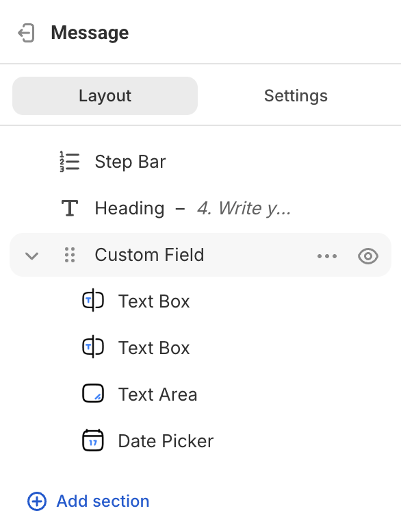
Once done editing individual options, click on the entire Custom Field section, go to the Styling tab, and adjust the section’s size, padding, border, and more.
5. Create More Steps (If Needed)
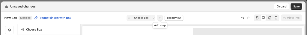
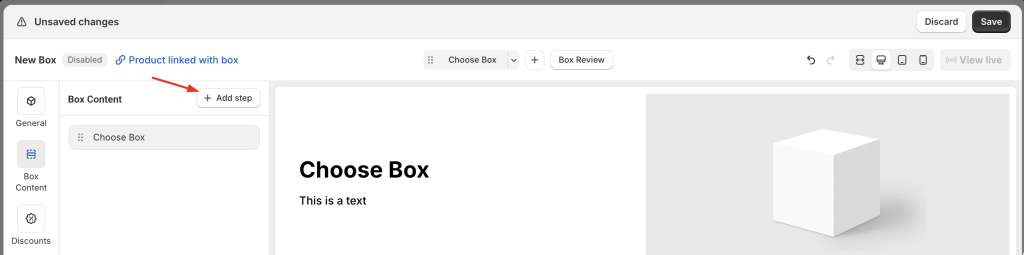
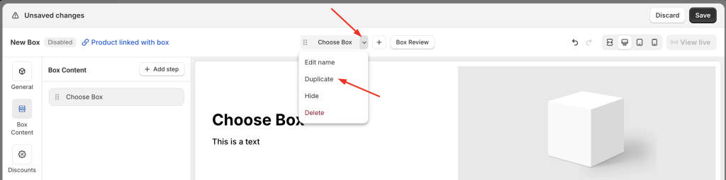
You can add new steps by:
- Clicking Add step in the step navigation
- Clicking Add step in the Box Content (page layout tree)
- Duplicating an existing step and editing it
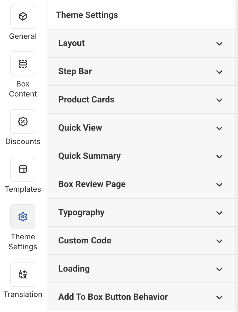
C. Update Global Styles in Theme Settings #
Click Theme Settings in the Visual Editor’s top menu to adjust overall design:
D. Set Up Discounts (Optional) #
🔔 Discount settings vary depending on your selected box type.
To configure:
- Go to the Discounts tab
- Change Status to Enabled
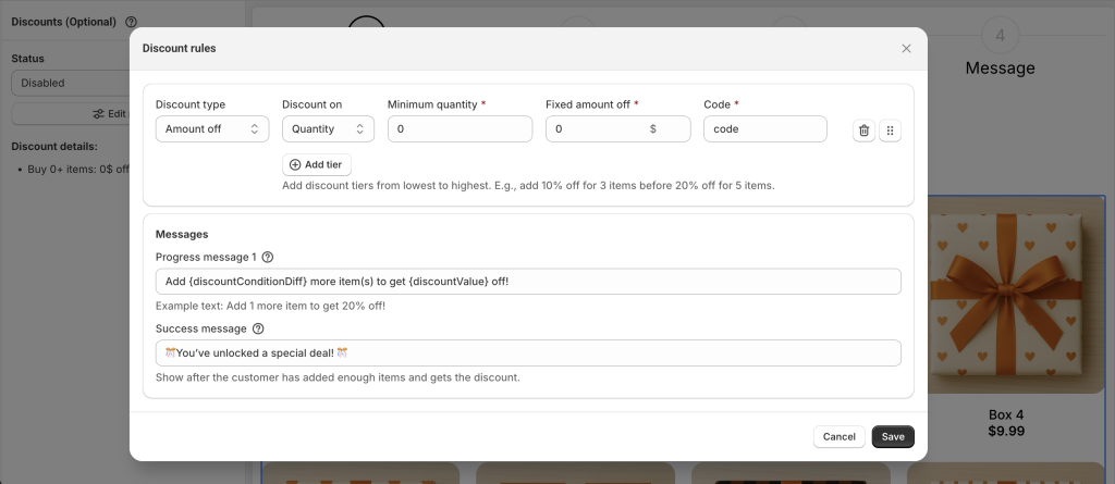
- Click Edit Rules to open the discount setup popup
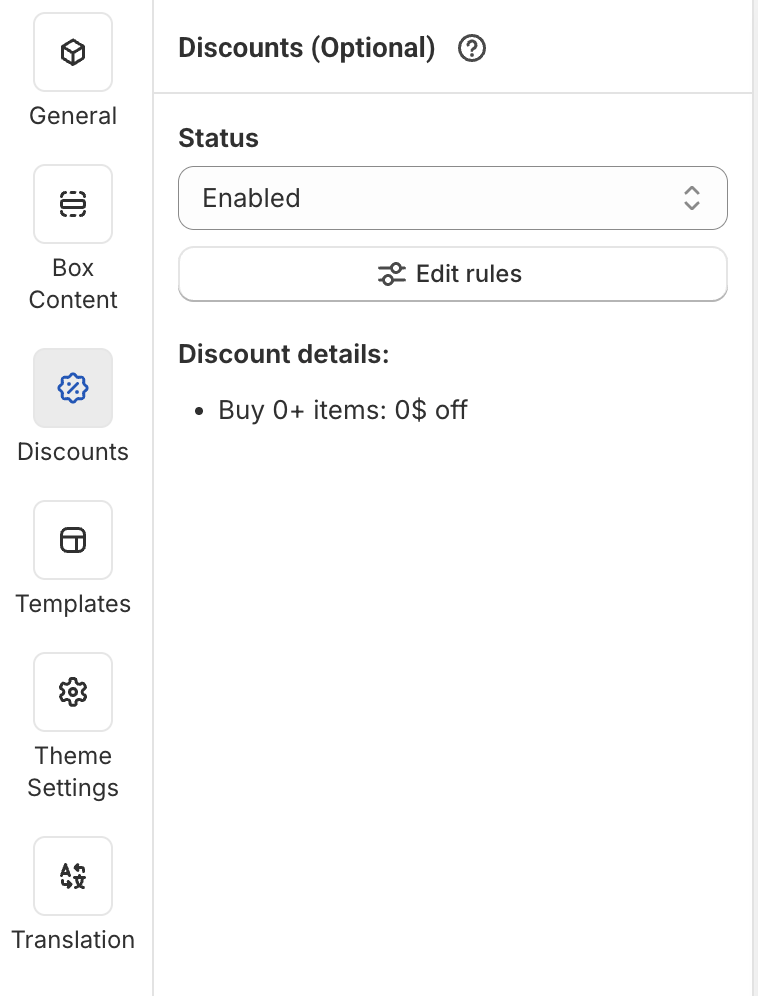
- Set up your discount logic as needed
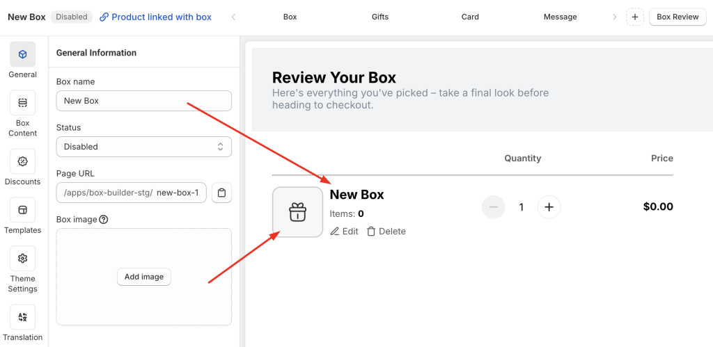
E. Update Box Information #
Go to the General tab and fill in:
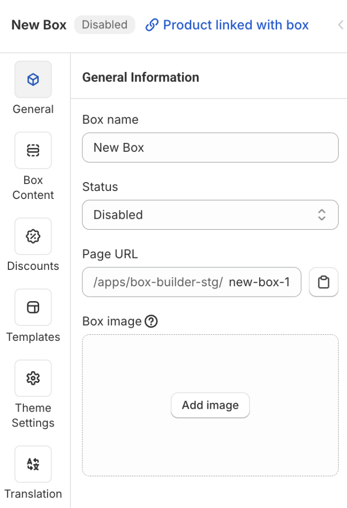
- Box name: Visible on Box Review Page, Cart, Checkout, and also used as the name of the auto-generated product linked to this box.
- Status: Set it to Enabled (default is Disabled) to publish your box.
- Page URL: Enter a unique handle (e.g.,
build-your-own-box), like any other store page URL. - Box image: Upload a square image. This will be shown on Box Review Page, Cart, Checkout, and also used as the featured image of the linked product. Non-square images will be automatically cropped.
F. Check the Box Design on Different Devices #
In the top-right corner of the Visual Editor, you’ll see the view mode switcher: Fullscreen, Desktop, Table, and Mobile.

Use this to preview how your box page looks on each device and make improvements as needed.
Each element or section has a Visibility setting in the General tab.
You can choose to show or hide that element on specific devices.
This is useful when you want to hide certain elements on mobile for a better experience.
G. Publish the Box Page #
When everything is set:
- In the General tab, change Status from Disabled → Enabled
- Click Save
You’ll now see a “View Live” button (disabled by default, enabled after you enable and save the box).
Clicking it will open your live box page on your storefront for final review.
💬 Need Assistance? #
We’re here to help—24/7!
Just click the live chat in the bottom-left corner of the app to get support at any time.