If you’re using the Image Swatch or Color Swatch option types and have many options for customers to choose from, you might prefer a cleaner presentation. That’s where the slider feature comes in handy. It allows you to turn long lists of swatches into a sleek, scrollable slider, making your product page more organized and visually appealing.
This guide will walk you through setting up your slider to display your swatches in a concise and eye-catching way.
Supported option types: Image Swatch and Color Swatch.
Availability: This feature is available on the Premium plan.
How to Set Up the Slider #
Step 1: Add Image or Color Swatch Options #
Start by adding an Image Swatch or Color Swatch option to your option set.
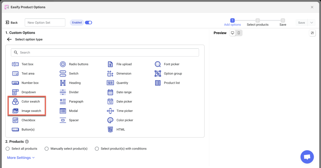
Step 2: Add Option Values #
Before enabling the slider, add all your option values (including images/colors, labels, and prices) as usual. This will help you determine how many option values you have, allowing for better slider layout and style configuration later.
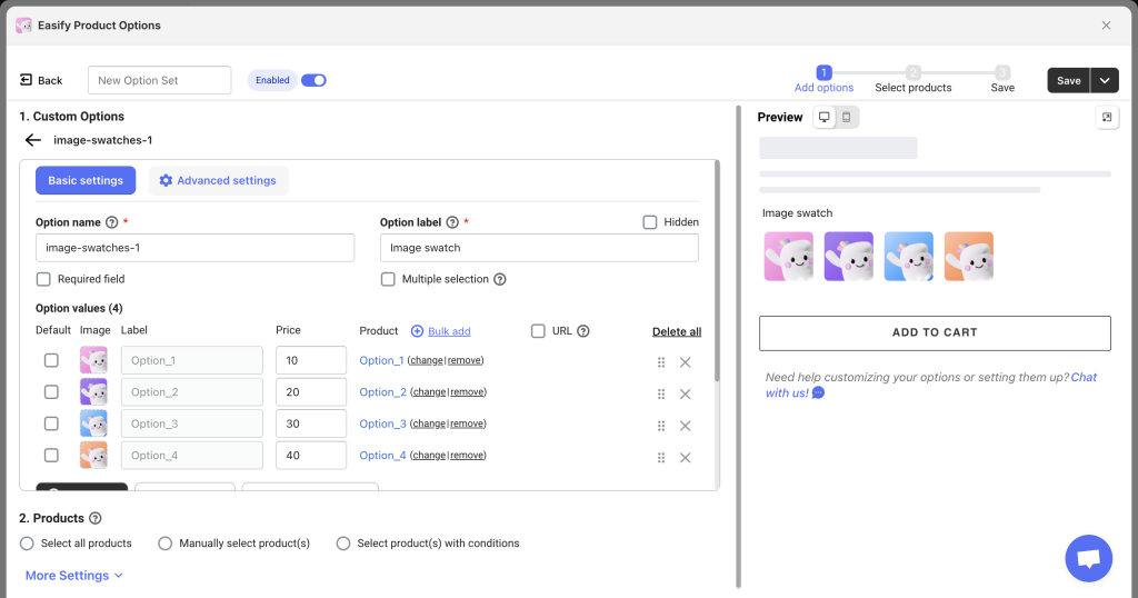
Step 3: Enable the Slider #
Once you’ve added the option values, navigate to the Advanced Settings tab. Check the box for Show Image Slider if you’re using Image Swatch, or Show Color Slider if you’re using Color Swatch.
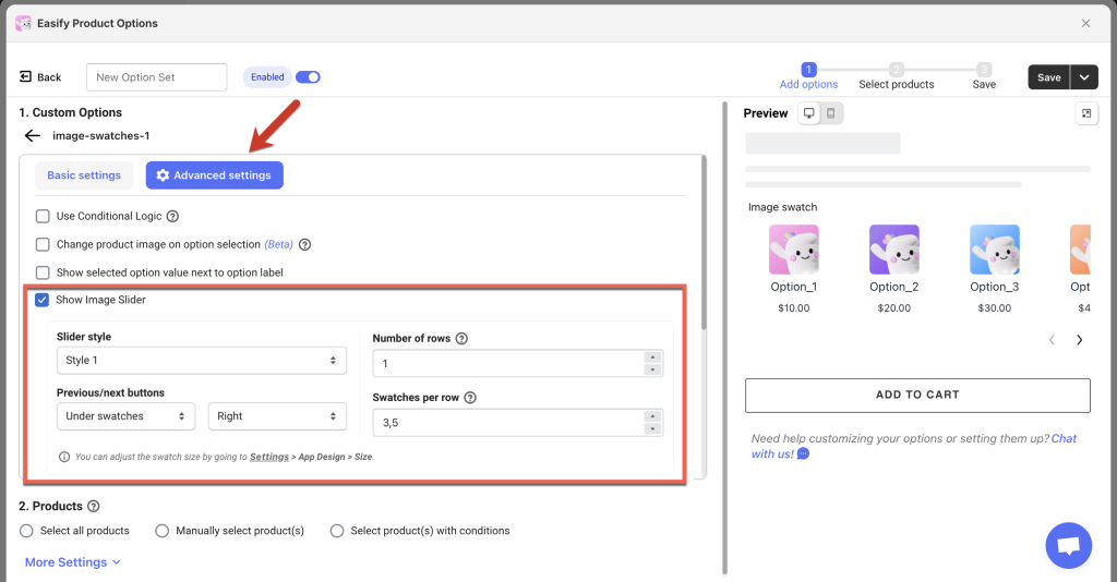
Step 4: Configure the Slider Presentation #
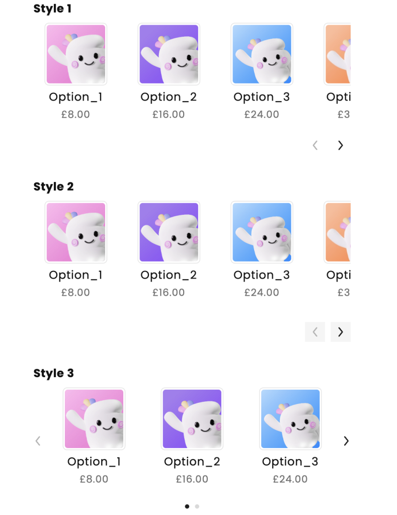
- Slider Style: Choose from 3 slider styles that best match your product page design. For Styles 1 and 2, you can select the placement of the Previous/Next buttons (Above swatches or Below swatches; Left, Right, or Center). For Style 3, you can choose whether to display Indicators (small dots below the slider).
- Number of Rows: By default, the slider shows 1 row. If you want to display more swatches at once, select the number of rows per slide. For example, with 2 rows and 4 swatches per row, you’ll show 8 swatches in one slide view.
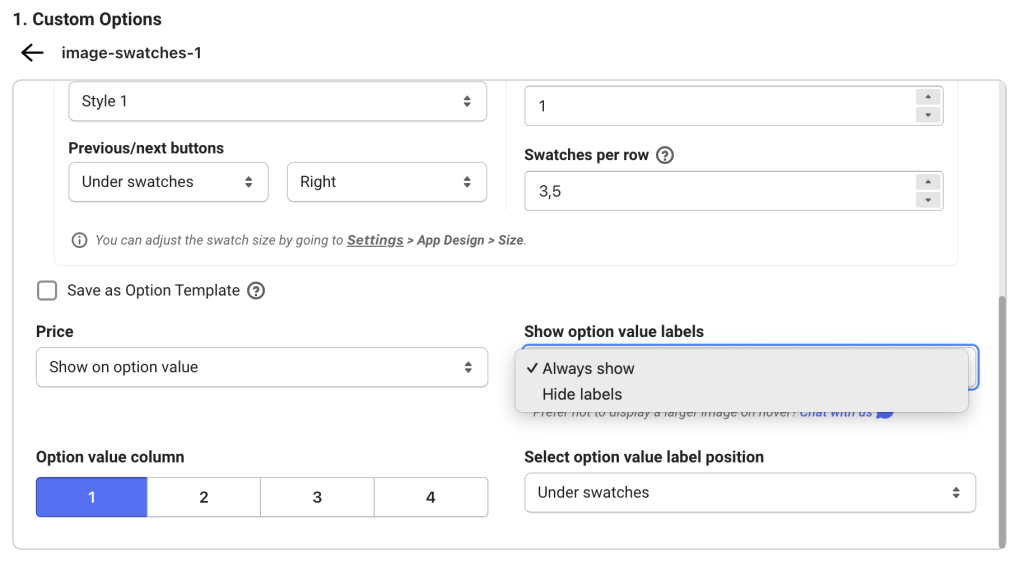
- Swatches per Row: You can specify the number of swatches (option values) per row. Consider factors like swatch size, length of option value labels, and the label position. For instance, if your swatches are the default size and the labels are under swatches, you can fit about 3 or 3.5 swatches per row. If the labels are next to swatches, you might fit 2 swatches per row. You can set round numbers (like 3) or 3.5 to show half of the last swatch if desired.
The app offers flexibility, so experiment to find the best layout for your options!
Step 5: Finalize Your Settings #
After configuring your slider, review your option set and assign relevant products to it. Don’t forget to save all settings. Then, check your storefront to see the results!
Step 6 (Optional): Configure Swatch Settings to Match the Slider #
- Option Value Label Position: When the Slider feature is enabled, the tooltip shown when hovering over regular swatches will be disabled. You can choose to display option value labels either Always Show (Next to swatches or Under swatches) or Hide Labels.
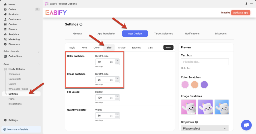
- Swatch Size: If you want to change the default swatch size, you can do so to fit more swatches per row. To adjust the size, go to the Settings page, open the App Design tab, select the Size tab, and edit the swatch size as needed. Keep in mind that this setting applies to all swatches in the app, not just those in the slider.
Need Assistance? #
If you have any questions or encounter issues while setting up your image or color swatch slider, don’t hesitate to reach out through our in-app live chat. We’re always here to help!