Light vs. Dark Themes in Shopify Stores #
While Light themes continue to dominate Shopify stores (used by around 80% of sites), Dark themes are gaining popularity, particularly in industries like tech, entertainment, and gaming.
Light themes are well-loved for their readability and versatility, making them perfect for businesses in health, legal, and home services. On the other hand, Dark themes offer a sleek, modern look that reduces eye strain, which appeals to a growing number of online shoppers.
Easify Product Options: Tailored for Both Light and Dark Themes #
Most Shopify product option apps only cater to Light themes, forcing merchants with Dark themes to manually customize their option styles—an often tedious task.
Easify Product Options, however, understands the diverse needs of merchants. That’s why we’ve developed 2 default style sets: one for Light themes and one for Dark themes.
With Easify, switching between styles is simple – just toggle between modes in the app settings, and your product options will adapt to your theme.
Key Features #
- Seamless Theme Integration: Easily switch between Light and Dark modes for your product options to match your store’s theme.
- Harmonized Color Palettes: Our default palettes, designed in Black, White, and Gray, complement current design trends while maintaining simplicity and effectiveness.
- Effortless Customization: Whether you’re starting fresh or switching themes, adjusting the Easify options is hassle-free. You can update your product options with a single click.
- Creative Flexibility: While the default styles are designed to look elegant on their own, you have the freedom to customize any element to match your store’s specific needs.
Demos #
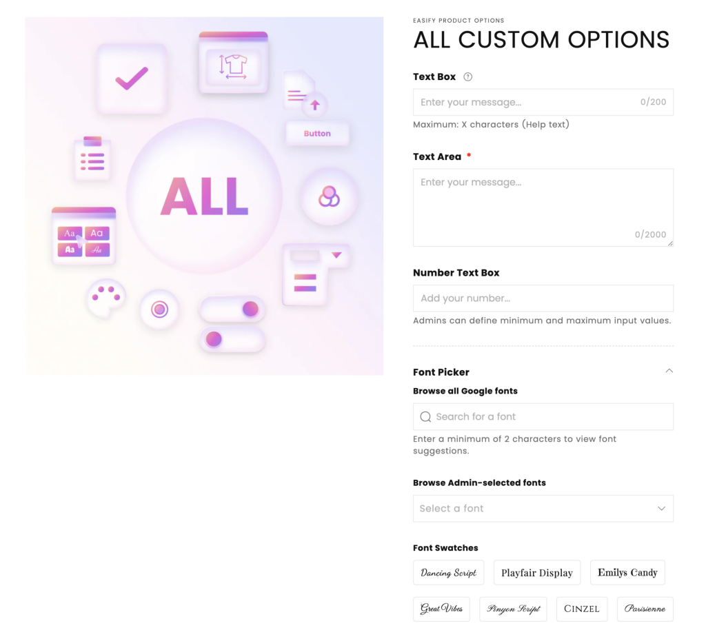
Light Mode: #
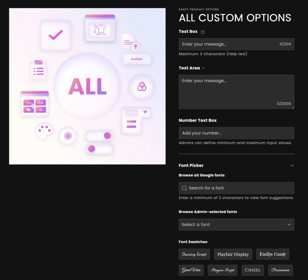
Dark Mode: #
How to Switch Between Light and Dark Modes #
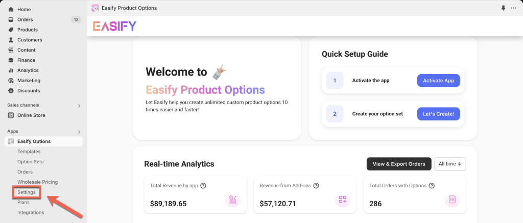
From the app’s navigation menu, go to Settings.
In the App Design tab, select General. Here, you can switch between Light and Dark modes.
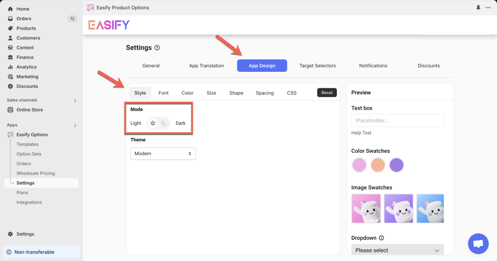
Once selected, the preview on the right will update automatically, giving you a real-time look at how your options will appear on your storefront.
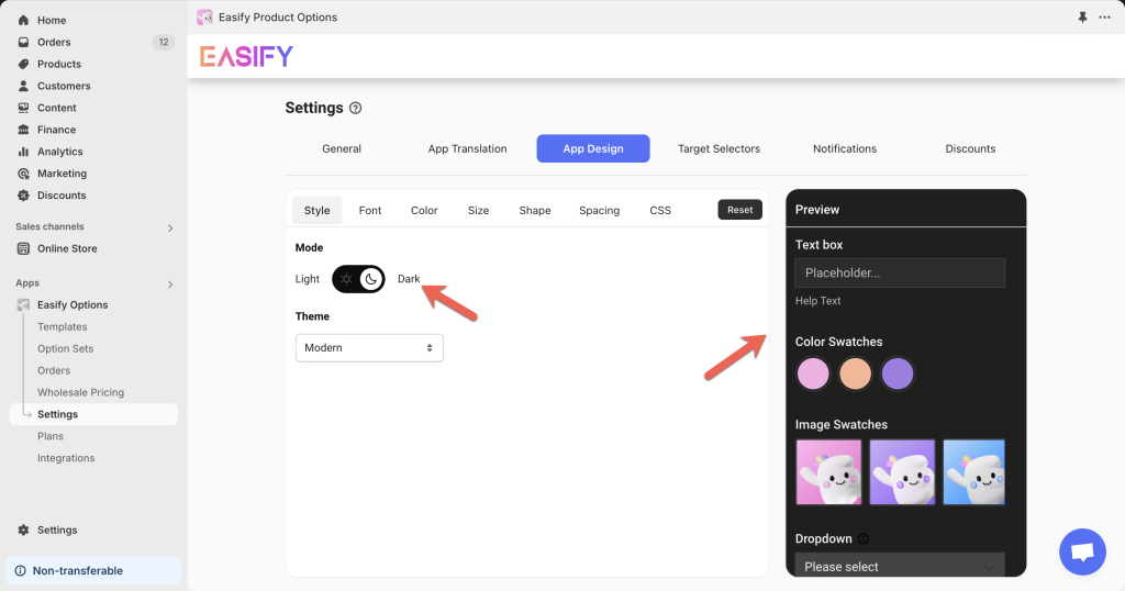
Additionally, when creating or editing an option set, the in-app preview will reflect the selected mode, allowing for easier setup and visualization.
How to Customize Elements in Your Selected Mode #
Our default color palettes are just the starting point. You can personalize every aspect of your product options to fit your brand.
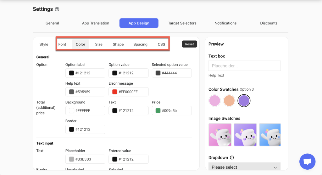
In the App Design tab, explore the other sections like Font, Color, Size, Shape, Spacing, and CSS to modify the appearance of your options.
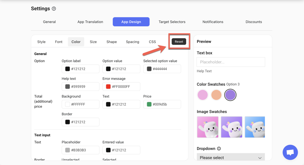
If you ever want to return to the original settings, simply click the Reset button.
Need Assistance? #
If you run into any issues while switching between modes or customizing your options, our support team is here to help! Reach out to us via in-app live chat for quick assistance.