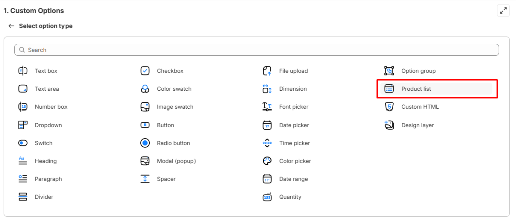
The Product List option type, exclusively provided by our Easify Product Options app, addresses the challenge of displaying numerous option values effectively.
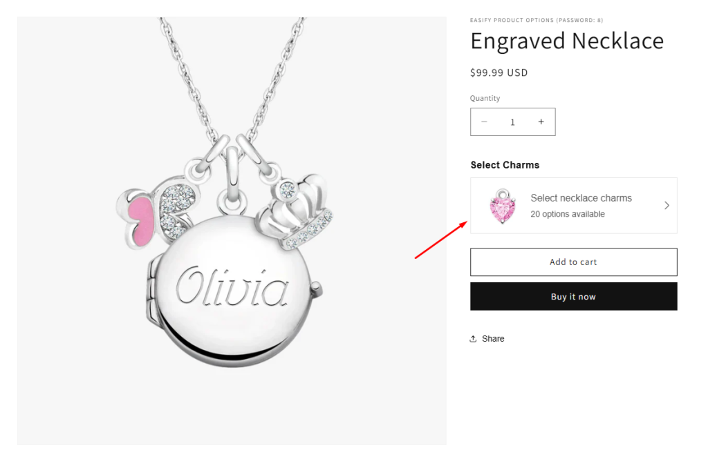
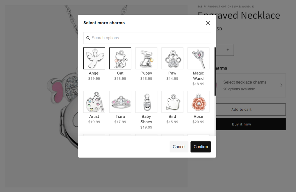
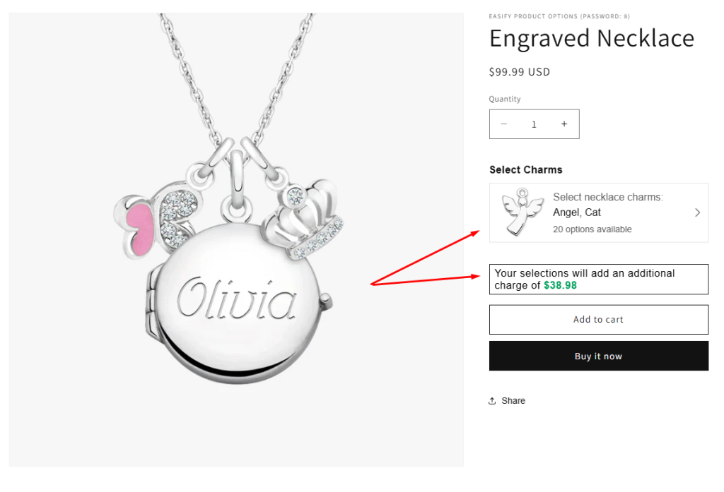
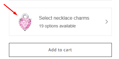
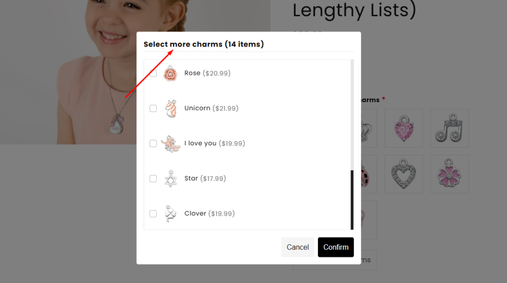
Unlike common option types that can make sites look cluttered and lengthy, the Product List presents a single button. When customers click on it, a popup appears, showcasing a list of option values (single or multi-select), which can be your existing products.
To further enhance usability, a search box is included for easy navigation. Additionally, you can choose between checkboxes or radio buttons, depending on whether customers can select one or multiple option values.
This option type is available on the Pro and Premium plan.
Option Settings #
1. Basic Settings #
Below are the details for each configuration in the Basic Settings of a Product List option type.
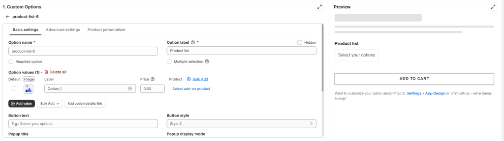
Option name: Give your Product list option a unique internal name, which will also be visible to your customers.
Option label: Add a label that is visible to your customers. Option labels can be the same or different for various options in the option set.
Required option: Make the Product list a mandatory selection if you want, ensuring customers select an option value before adding the product to cart.
Hidden: Hide the option label if you wish to keep the interface cleaner or prefer it not to be visible to users.
Multiple selection: By default, customers can select only one option value. To allow multiple selections, enable the “Multiple selection” checkbox and specify the minimum and maximum number of selectable options (or leave blank to allow any number).
Option values: The option values section allows you to define the choices presented in the Product List option.
- Default: Set default selected option value(s) on the popup. You can select only 1 or more default values. Note that you must select the checkbox “Multiple selection” to choose more than 1 default option value.
- Image/Color: Upload an image for the option icon or specify a colour code (or leave it blank)
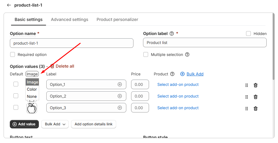
- Label: Add the name of the option value visible to your customers.
- Price (Pro): Set an extra price for each of your option values (if any).
- Add-on Product (Pro): Set an extra price for your option values independently or assign an option value to an existing related product/ product variant in your store. The option’s image, label and price will update based on the linked product’s details. Refer to a specific guide on how to set up product add-ons here.
- Add option details link: Add a link to provide more information about the option value during purchase.
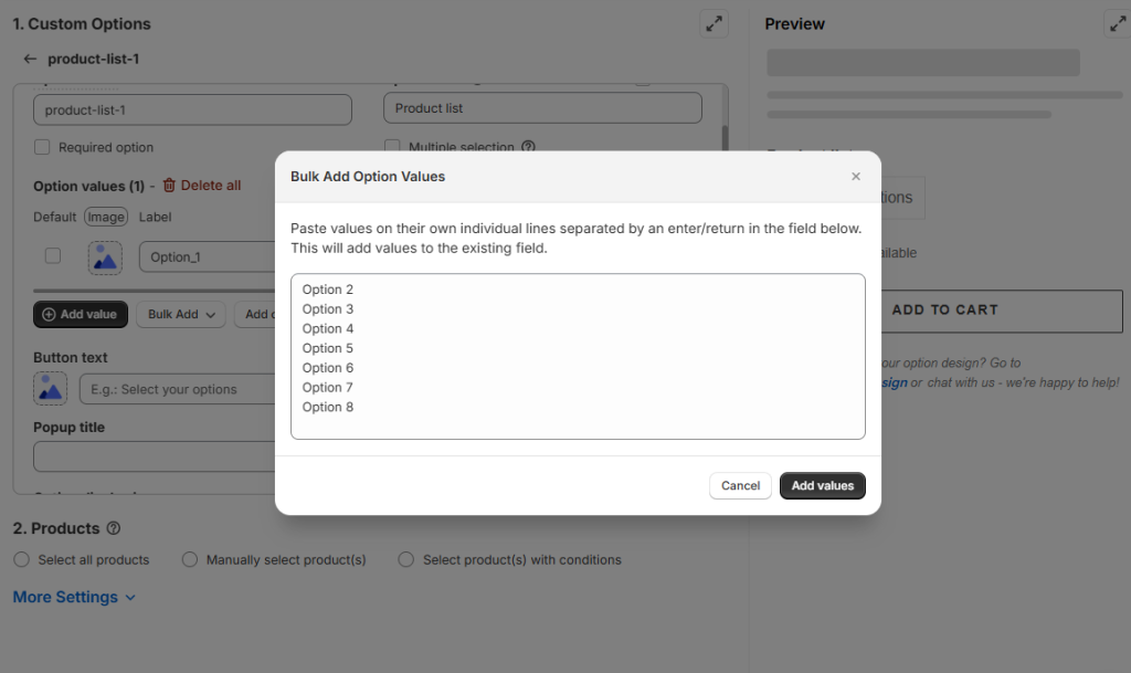
- Bulk add: Save time by adding option value labels in bulk. You can bulk upload:
- Option value images
- Add-on products
- Option values
- Option details links
Button style: Choose between two button styles. Style 1 is the latest design, while Style 2 offers a classic look!
| Button style | |
| Style 1 |  |
| Style 2 | 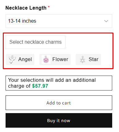 |
Button text: Customize the button text if you want, the default button text is “Select an option”.
Button image: Available only in Style 2
Popup title: Add a title to be shown on the popup. If left blank, no title will be displayed.
Popup display mode: Choose how the pop‑up is displayed
- Style 1: Select Popup, Full screen or Slide in mode.
- Style 2: Supports only Popup mode.
| Example | |
| Popup | 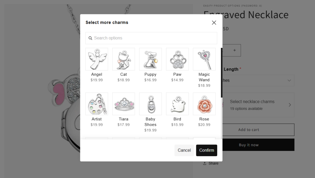 |
| Full screen | 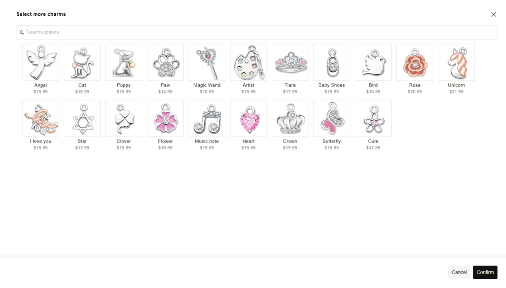 |
| Slide in | 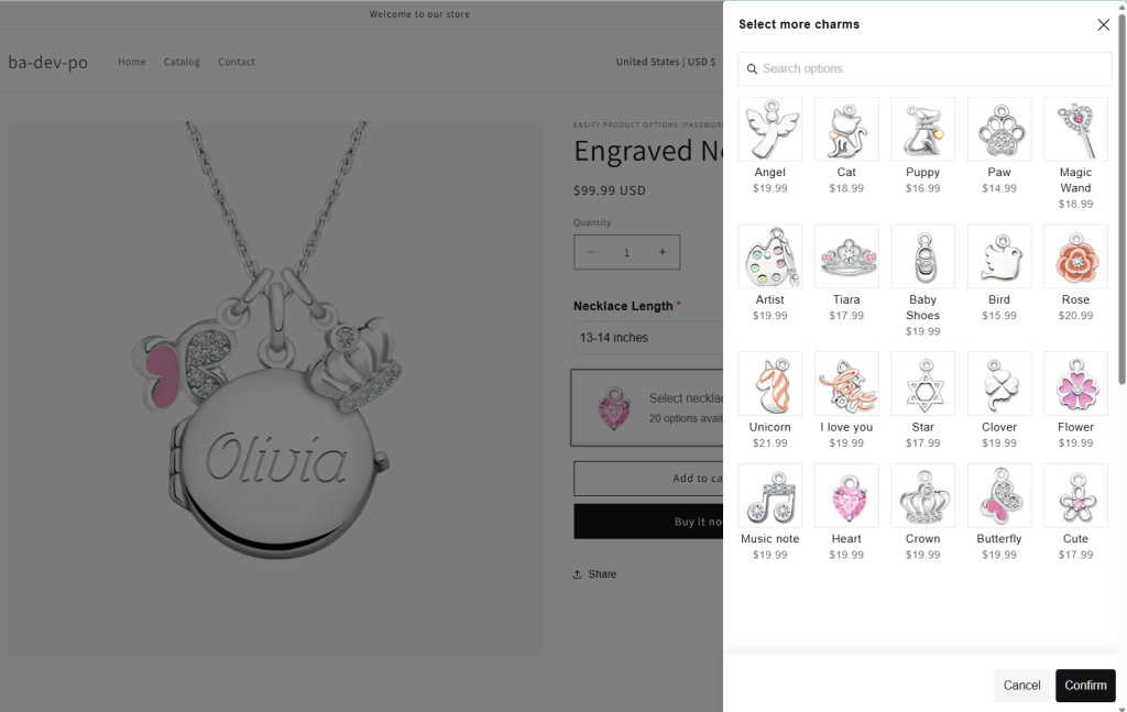 |
Option display in popup:
- Style 1: Display options as swatches or as a list.
- Style 2: Display options as a list only.
| Example | |
| Show option as swatches | 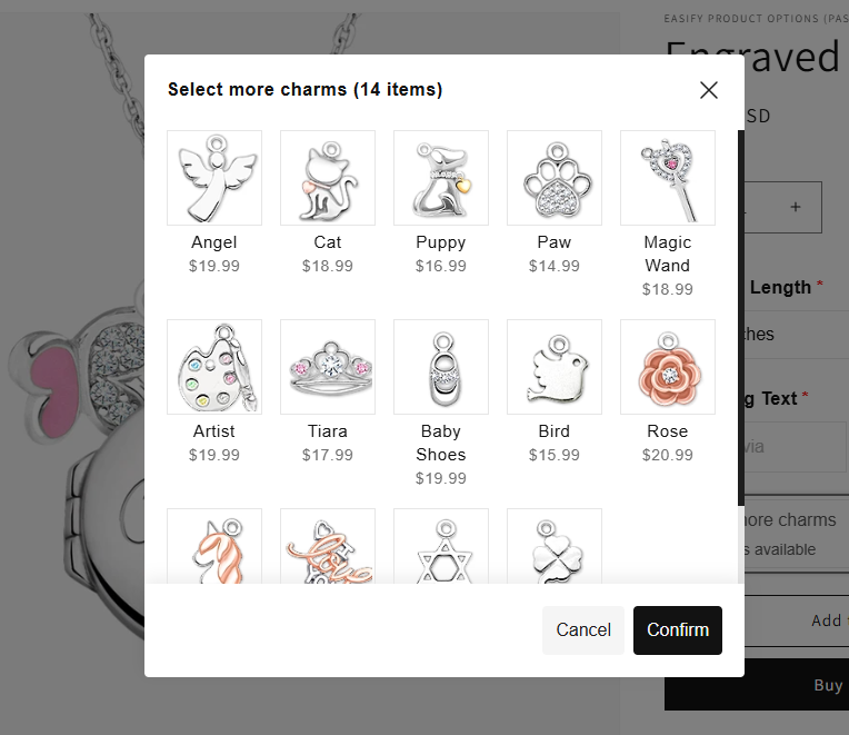 |
| Show option as list | 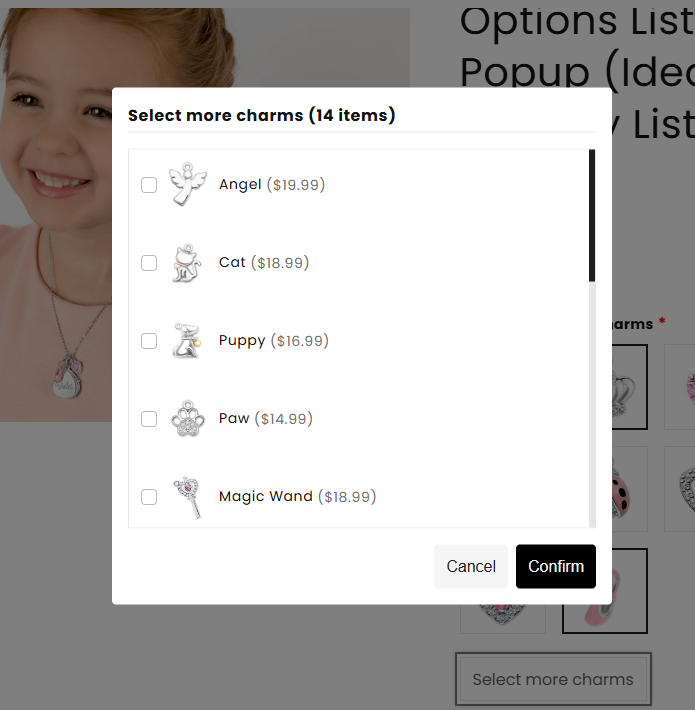 |
Swatch shape: Defines the shape of each option’s image or color.
Show swatch on selection: When this feature is enabled, the image/color of the selected option value will display.
| Swatch on selection position | |
| Style 1 | 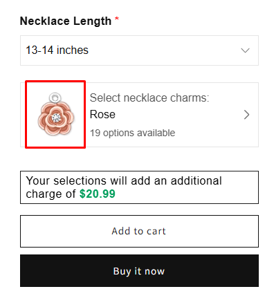 |
| Style 2 | 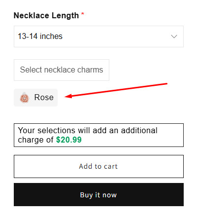 |
Custom swatch size: Adjust the swatch size if needed.
Help text: Enter helpful text to guide customers while selecting options.
| Help text position | |
| Style 1 | 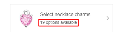 |
| Style 2 | 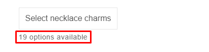 |
Info: Create an informative tooltip that appears when users hover over a small icon, providing more context or assistance.
Column width: Adjust the width of the entire Product List area—choose 25%, 33%, 50%, 66%, 75% or 100%. For example, if you have four Product Lists in style 2 and want their selection buttons aligned in a single row, set each to 25%.
2. Advanced Settings #
Conditional logic: Determine the visibility of the Product list, ensuring it appears only when specific custom options or Shopify variants are selected. To set up the conditional logic for your Product list, follow this guide.
Allow quantity selector for option value: Display a quantity selector of each option value directly within the Product list. You can limit the quantity input by setting increments, fixed totals or minimum and maximum limits.
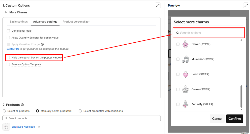
Hide the search box on the popup window: A search box appears in the pop‑up. Enable this option to hide it.
Need Assistance? #
If you run into any challenges while configuring your custom options, feel free to reach out to us for assistance through our convenient in-app live chat, by submitting your request via our contact form, or by sending an email to support@tigren.com. We’re here to help!