- Supported Option Types
- Introduction to the Setting panels
- How To Set Up the Product Personalizer
- Learn more
Our Product Personalizer feature is designed to be simpler and easier to use for non-tech users compared to other advanced personalization apps, while still offering all the essential features you need.
If you’ve been using the app and know how to set up custom options, you can continue setting up your custom product options as before. The live preview settings build on the core option settings, adding an advanced layer rather than replacing them.
If you’re new to the app, we recommend starting with the basics – setting up options without live previews – to get a feel for how the app works. Once you’re comfortable, come back here to learn how to enable and customize live previews.
Supported Option Types #
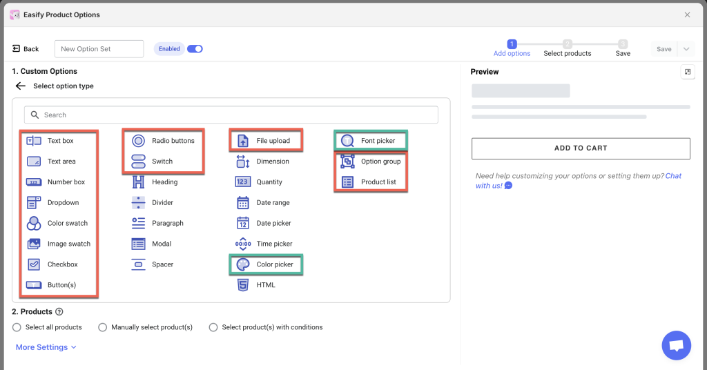
1. Text fields:
- Text Box (single-line)
- Text Area (multi-line)
- Number Box (numeric input)
These can be combined with Font Picker, Color Picker, or Color Swatch options for preview purposes.
2. Image upload: File Upload.
3. Other option types:
Introduction to the Setting panels #
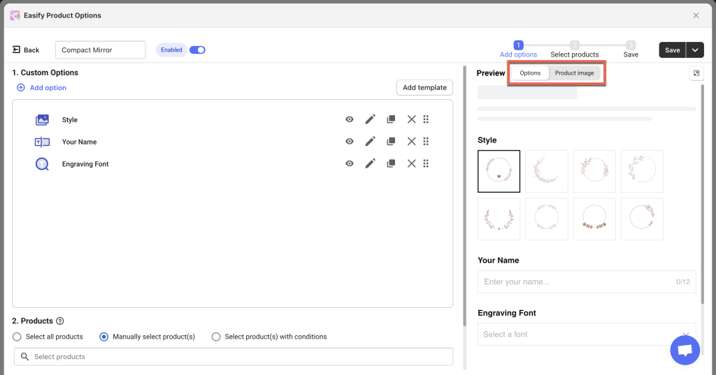
1. Product personalizer tab #
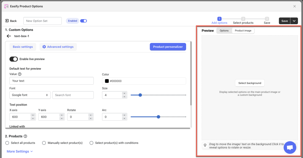
Each option that supports live preview has a Product personalizer tab, located at the top right of the option’s settings area (Basic settings and Advanced settings are on the left).
Example: Text Box
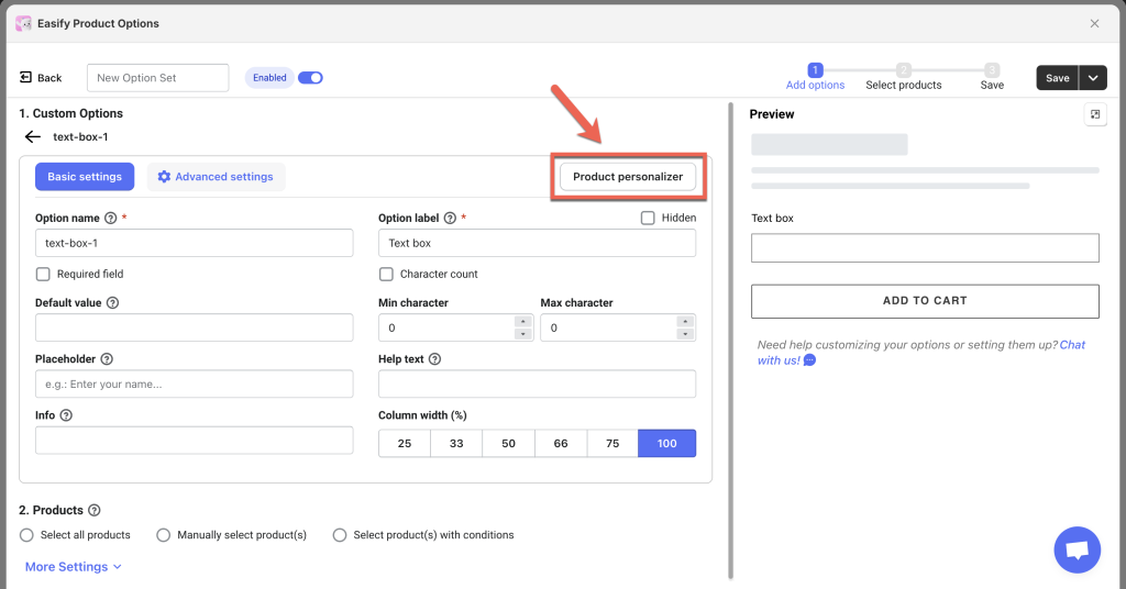
The Product personalizer tab includes the live preview configuration options. It works closely with the Basic settings and Advanced settings. Therefore, it’s best to complete the Basic settings and Advanced settings first before configuring the Product personalizer.
For example:
- If a text field has a Default value in the Basic settings, that value will appear as the default preview text (“Value”) in the Product personalizer.
- Similarly, an option value with an image set as default (pre-selected) in the Basic settings will use that image in the preview.
2. Preview panel #
Background setup #
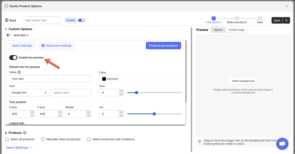
When enabling live preview, the first step is to set the background image for the preview. Make sure to do this before adjusting any other preview settings.
a. Select background
There are 2 background options you can choose from: Main product image and Custom background.
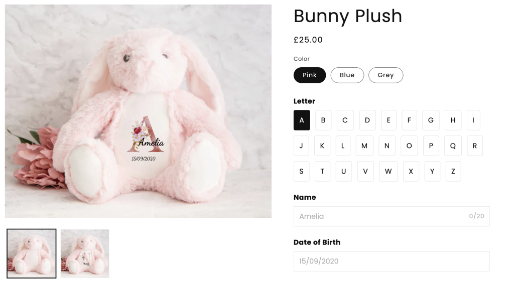
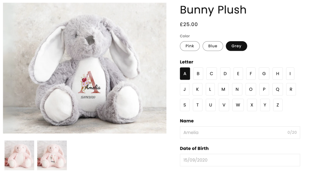
- Main product image: The preview of text or images will appear directly on the product’s main image.
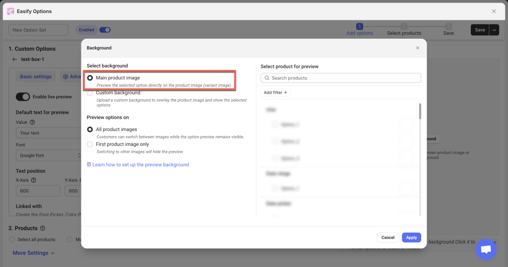
If your product does not have variants, the preview will display on the first image of the product.
If your product has multiple variants, the preview will adjust based on the selected variant’s specific image.
If you want to show different options with different previews depending on the chosen variant, you can set up advanced conditional logic with Shopify variants.
Select a specific product for preview: You must select a specific product or product variant to show in the Preview panel before configuring additional settings. Even if your option set is assigned to multiple products rather than just one, you still need to pick a single product to guide the preview setup.
- Custom background: If you prefer not to use the product’s main image for the preview, you can upload a custom background instead.
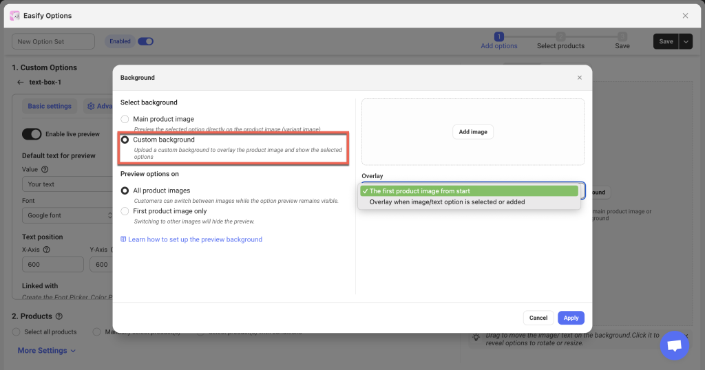
For example, if you sell custom phone cases, your main product image might show an angled view of the phone case with an example design. However, for customization, you might want to use a blank phone case (a straight-on view) as the background, making it easier for customers to personalize their product.
The custom background can overlay the main product image either from the start or once the customer uploads their image or selects options.
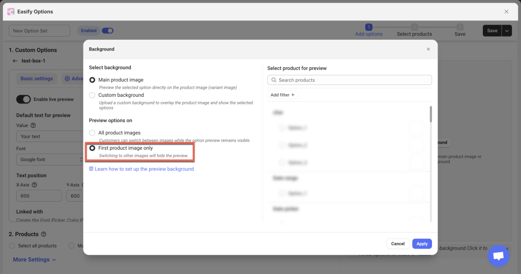
b. Preview options on
After selecting the preview background (either your main product image or a custom background you upload), decide how you want the options to be displayed:
- All product images (default): Display selected options on all product images. Customers can switch between images while the option preview remains visible.
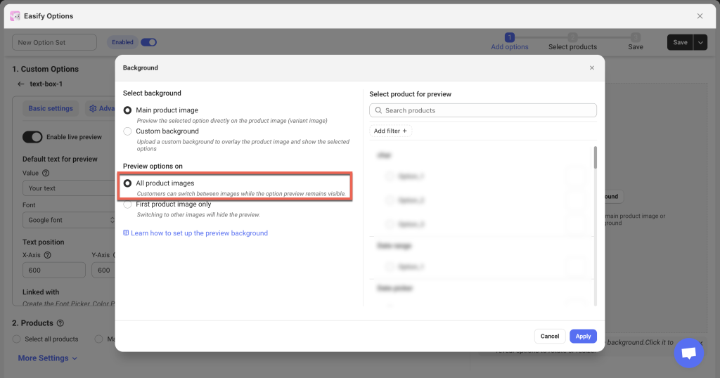
Example:
- First product image only: Display selected options on the first product image. If customers switch to other images, the preview will not appear.
Example:
Options/ Product Image tabs #
Once the Product personalizer/ live preview is enabled for at least one option, you’ll see 2 tabs in the Preview panel: Options and Product Image.
- Options tab: Displays the list of options as customers will see them on the storefront.
- Product image tab: Shows the product image (or your custom background) and how the selected options appear over it.
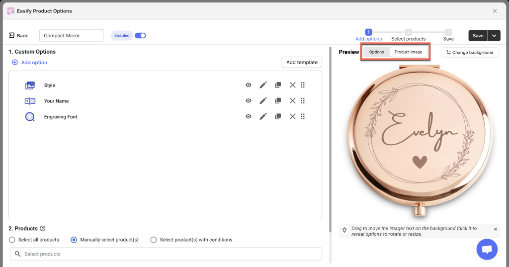
In the Product Image tab, you can:
- Drag and reposition text or image elements directly on the preview.
- Click on any element in the preview to show controls that let you freely resize and rotate that element.
Future Update: In a later phase, we plan to combine both tabs into one for even more convenient settings.
Option and Text/Image element order #
The order of the options created in the left panel determines the layer order of the design elements in the right panel.
- Options higher in the left panel appear lower in the layer order in the right panel (bottom to top).
- This follows the logic of customers selecting options from top to bottom on the storefront, often matching the inside-out design layers (e.g., for a poster, the background is selected first, followed by other elements on top).
Keep this in mind when creating options to ensure the correct visual layering in the final product preview.
How To Set Up the Product Personalizer #
Step 1: Identify Which Options Require Live Preview #
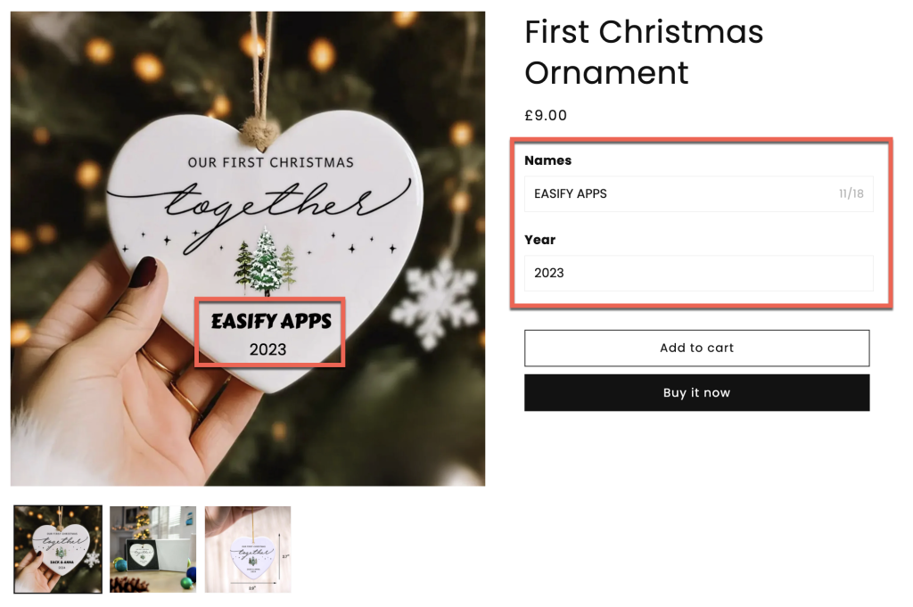
Decide which options can (or should) be visualized in the product preview. For example, if you sell Ornaments that customers can personalize with a photo and text, those options should appear in the live preview. You might include:
- File Upload: For customers to upload their photo.
- Text Box or Text Area: For customers to enter their personalized text.
- (Optional) Font Picker, Color Picker or Color Swatch: For customers to change text style and color.
You can also add more options without previews to complete your option set before assigning it to your product.
Step 2: Set Up Options in Basic & Advanced Settings First #
Begin by setting up your options in the Basic settings and Advanced settings tabs as you normally would. Don’t worry about the Product personalizer tab at this stage.
For example, if you’re adding a Text Box, you can configure its label, minimum/maximum characters, placeholders, default value, pricing, conditional logic, etc., before moving on to the live preview settings.
Step 3: Enable the Live Preview in the Product personalizer tab #
Once you have finished configuring the Basic settings and Advanced settings, open the Product personalizer tab and enable the live preview for the relevant options.
If an option does not need a preview, you can leave it disabled. Also, for option types that don’t support Product personalizer, this tab will not appear.
Step 4: Configuring the Live Preview #
Each option type may have unique settings in the Product personalizer tab. Below are detailed instructions for each supported type.
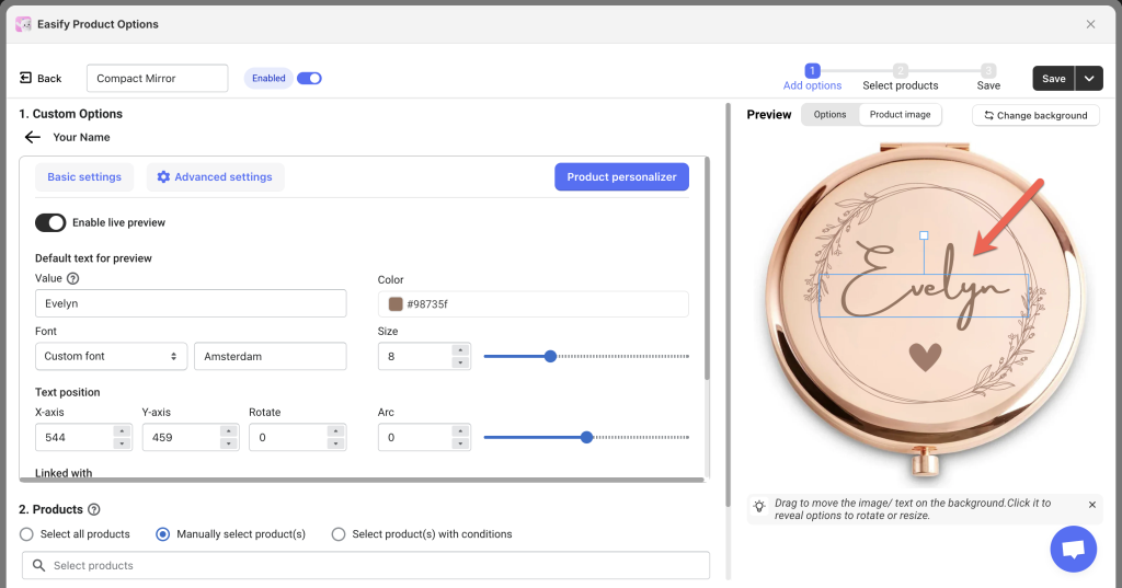
Text Box/ Number Box #
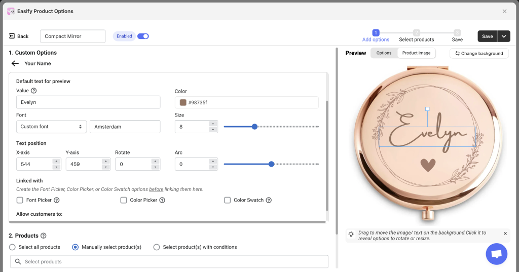
Default text for preview
Value: Displays the default text value in the preview.
- If a “Default value” is already set in the Basic settings, it will automatically populate here.
- If no “Default value” is set in Basic settings, you must define one here (e.g., “Your text” or “Your name”). Changes made here will not sync back to Basic settings; they apply only to the live preview.
Color:
- Set a default color for the text in the preview.
- If customers are not allowed to choose a text color, the default color will be applied to the final product.
Font:
- Set a default font for the text in the preview.
- If customers are not allowed to choose a font, this default font will be applied to the final product.
- Select a font from Google fonts or upload custom fonts in the Settings page.
Size:
- Set a default size for the text in the preview.
- If customers are not allowed to change the text size, this size will be applied to the final product.
Text Position
Drag and move the text in the Preview Panel, or manually adjust the X-axis, Y-axis, Rotate, and Arc settings. Changes made directly in the preview panel will reflect in the settings panel, and vice versa.
- X-axis: Moves the text horizontally. Increase the value to shift the text to the right; decrease it to move it left.
- Y-axis: Moves the text vertically. Increase the value to move the text down; decrease it to move it up.
- Rotate: Rotates the text. Adjust the value to tilt the text clockwise or counterclockwise.
- Arc: Adds curvature to the text. Increase the value to create more curvature or set to 0 for straight text.
Linked with
If you allow customers to select fonts or colors, link the Text Box to a Font Picker or Color Picker/Color Swatch. Ensure the linked options are already created before linking.
- Font Picker: Allows font selection via a dropdown or font swatches (supports Google Fonts, custom fonts, or both).
- Color Picker: Lets customers choose any color from a palette.
- Color Swatch: Restricts color selection to specific colors you define.
Allowed customers to:
- Change text position: Enable this to let customers drag and reposition text in the preview. Disable it to lock the position.
- Change text size: Enable this to let customers adjust text size in the preview. Disable it to lock the size.
Text Area #
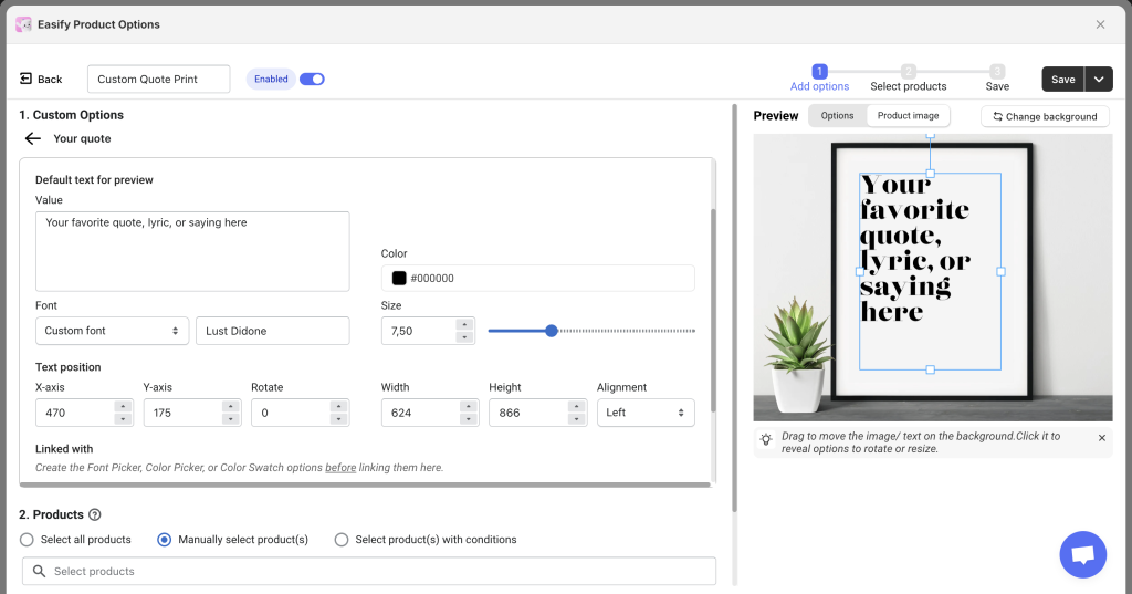
The settings for Text Area are similar to those for Text Box, with a few differences:
- Value: Allow multiline default text (press “Enter” for line breaks).
- Arc: This setting is not available for Text Area; arcs can only be applied to Text Box.
- Width and Height: Define the dimensions of the text area frame.
- Alignment: Adjust text alignment (left, center, or right) within the frame.
File Upload #
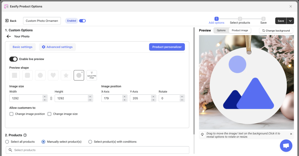
Preview shape:
Choose from basic shapes or upload a custom PNG. The uploaded image will fit into the selected shape. You can adjust or unlock the shape’s size ratio if needed.
Image size:
Set the Width and Height of the uploaded image preview. You can adjust these manually or by dragging in the preview panel. Changes made in the panel will automatically update the size fields. By default, the aspect ratio is locked, but it can be unlocked for free customization.
Image position:
Drag the file upload image in the Preview panel to adjust its position. The values for X-Axis, Y-Axis, and Rotate will update automatically.
Allow customers to:
- Change image position: Enable this to let customers drag the uploaded image in the preview. Disable it to lock the position.
- Change image size: Enable this to let customers resize the uploaded images in the preview. Disable it to lock the size.
Image Swatch, Dropdown, Button, Checkbox, Radio Button, Product List, Switch #
Optional Image for Preview: For certain option types, you can choose to upload images for each option value. This feature offers three different preview options:
- Single Image for Selection and Preview: Upload one image. This image is used both in the option selection and the live preview.
- Separate Images for Selection and Preview: Upload two images.
- First image: Shown in the option selection.
- Second image: Used in the live preview.
- Preview Image Only: Upload only the second image. The preview uses this image, and the option selection will display only the option labels without image swatches.
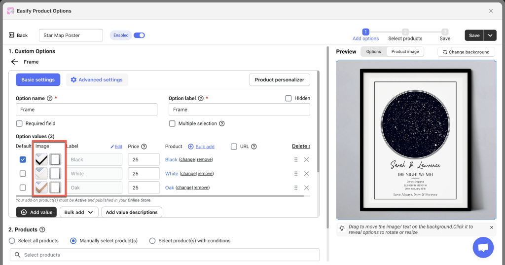
You can mix and match these three methods for different option values within your product option.
Preview shape:
- As with the File Upload type, you can choose a basic shape or upload a custom PNG shape for the preview.
- After selecting a shape, you can unlock the aspect ratio and adjust the shape’s size if needed.
Tip: It’s recommended to select a default option value in the Basic settings. This way, the image of that option value will appear in the Preview panel, making it easier to visualize the setup.
Image size:
Set the Width and Height of the option image preview. You can adjust these manually or by dragging in the preview panel. Changes made in the panel will automatically update the size fields. By default, the aspect ratio is locked, but it can be unlocked for free customization.
Image position:
Drag the option image in the Preview panel to adjust its position. The values for X-Axis, Y-Axis, and Rotate will update automatically.
Allow customers to:
- Change image position: Enable this to let customers drag the selected option image in the preview. Disable it to lock the position.
- Change image size: Enable this to let customers resize the selected option image in the preview. Disable it to lock the size.
Multiselection – For Image Swatch, Button, Checkbox, Product List
For option types that allow selecting multiple values, you can still set up a preview. However, consider these points:
- Initial option image positions: If you enable multiselect or if the option type inherently supports multiple selections (like Checkbox), you must configure a default position for each selected option. When customers select these options, they will appear in the positions you’ve set.
- Allow customers to change image positions: You can enable this so customers can rearrange multiple selected options themselves.
Examples of Multiselection with Live Preview:
- Charm Bracelets: Customers can select multiple charms (hearts, initials, symbols) to add to a bracelet, and see them appear together in the preview.
- Pizza Toppings: Customers can choose multiple toppings and see them layered on the pizza in real time.
- Gift Basket Items: Customers can pick multiple items to include, and the preview will show the basket filled with their selections.
- Birthday Cakes: Customers can add candles, toppers, or decorations and see them appear on the cake preview as they select them.
Color Swatch #
A Color Swatch can be linked with text fields to choose text colors that will show in the preview, or it can function independently.
Unlike option types that can directly use image swatches for preview, a Color Swatch requires you to upload an image for each color option value.
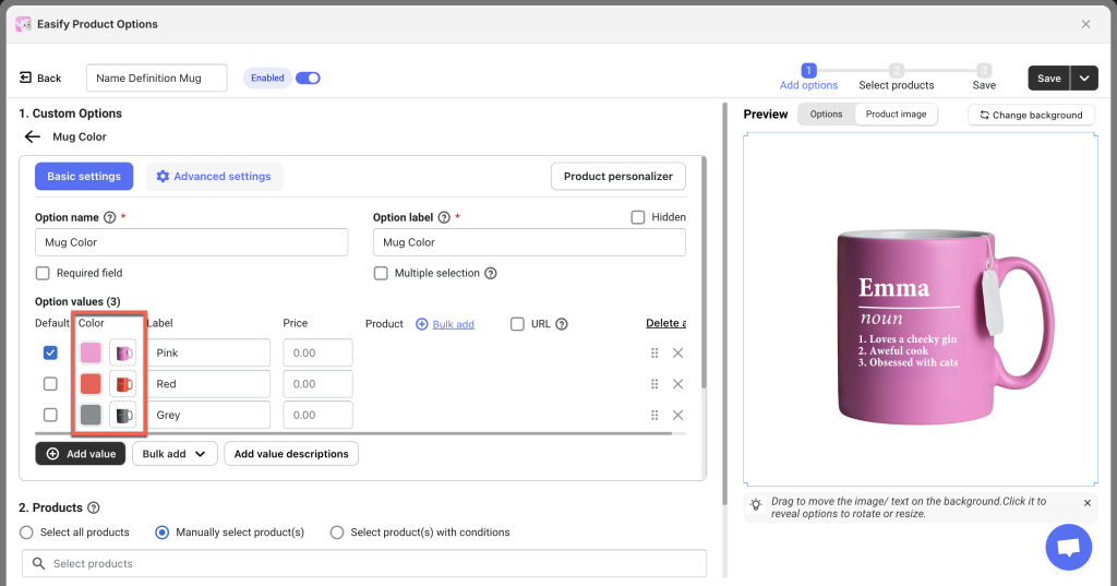
Other settings in the Product personalizer tab for Color Swatch are similar to those for the option types that support images.
Step 5: Assign the Option Set to Relevant Products #
Assign the Option Set:
- Select the product(s) you want the option set to appear on.
- If you don’t assign the option set to any products, it won’t show up on your store.
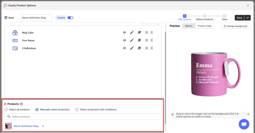
Re-select the Preview Product:
- Even if you selected a product for the Preview panel earlier, you must select it again here.
- The selected product in the Preview panel is only for preview purposes and does not apply to the actual product assignments.
Ensure Image Consistency:
- If you’re assigning the option set to multiple products, make sure their images are similar.
- This consistency ensures that the defined text or image positions look good on all assigned products.