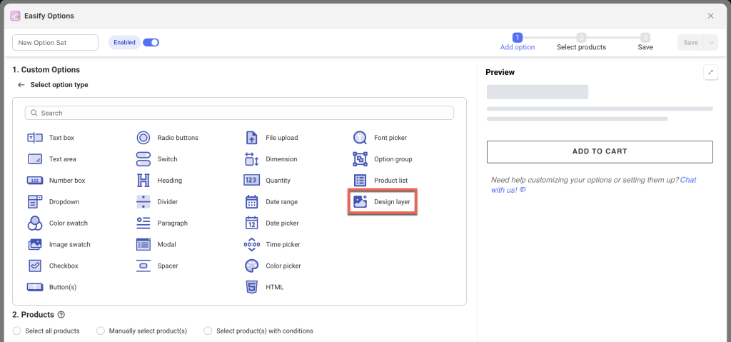
The Design Layer is an image that sits directly on top of your product image. You can use it for different purposes, such as enhancing live previews for file uploads or adding decorative labels to your product images.
This option type is available on the Premium plan.
When to Use the Design Layer? #
For Product Personalizer – Live Preview with File Upload #
If your customers can upload their own images (using the File Upload option), and your product needs an additional visual layer placed on top of that uploaded image (to make the preview look more realistic), the Design layer is the perfect solution.
Here are 2 examples to help you visualize how this works:
Example 1: Customized Card Holder
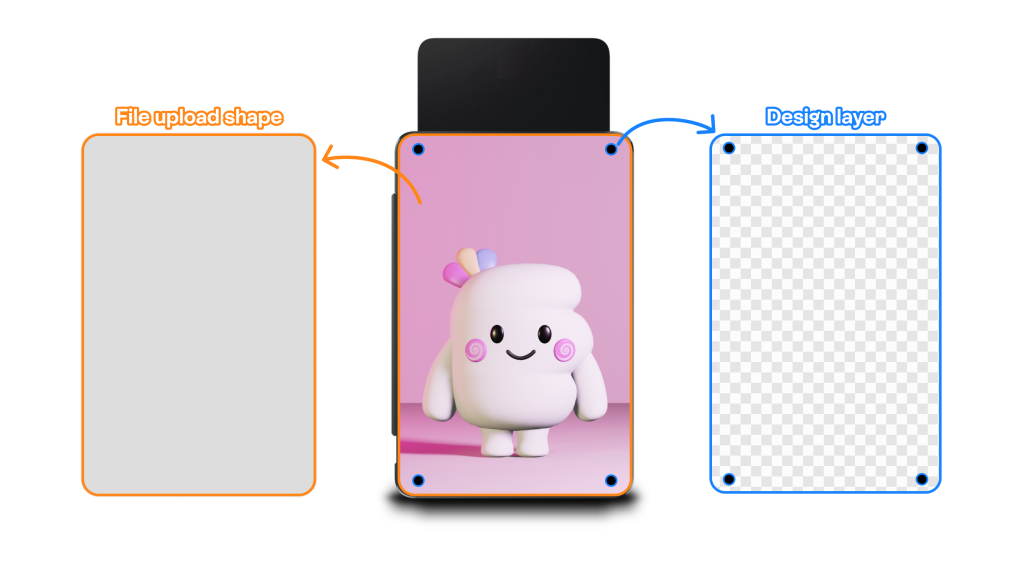
In this setup:
- Customers upload their own image onto a card holder product.
- The product image originally has 4 small dots printed on it (used to hold the image).
- When customers upload an image using the File Upload shape, that shape appears above the product image – hiding the 4 dots in the process.
✅ Solution: Use a Design layer with just the 4 dots (the rest of the image should be transparent). This way, the dots appear on top of the uploaded image, making the preview look more realistic – just like the actual product.
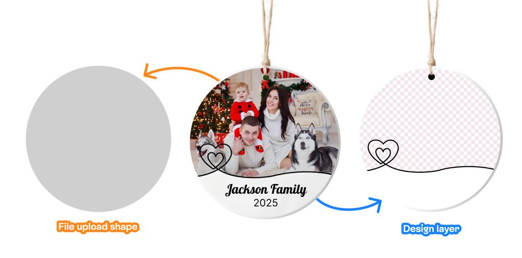
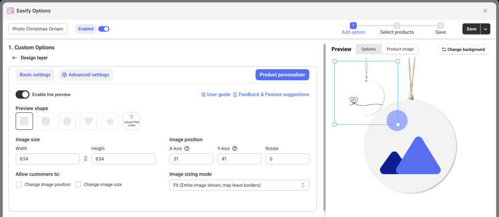
Example 2: Personalized Ornament (Demo)
Some products, like ornaments, have complex designs (e.g. hearts or curves). In these cases:
- It’s hard to create a custom shape for the image upload that leaves parts (like the hearts) transparent.
- File upload shapes are solid and can’t mimic those see-through areas.
✅ Solution: Use a Design layer that contains the pattern (like the hearts), and place it over the uploaded image. This helps present a much more accurate and appealing preview to your customers.
You can decide what image to use as the Design layer based on your product’s design and how you want it to look in the preview.
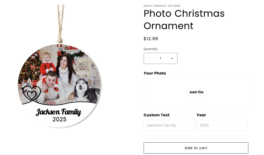
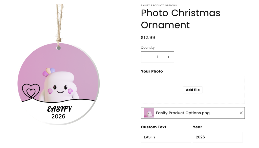
On the product page:
Notes:
- Design Layers can appear by default or be shown conditionally (using the Conditional logic feature), depending on customer selections (just like other option types).
- Preparing a proper Design layer often requires some basic design tools. If you’re not familiar with any, simply reach out to us via our in-app live chat, our designers are happy to help!
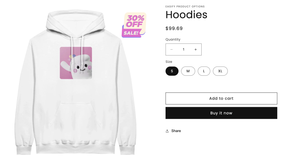
For Labels and Badges #
You can also use the Design layer to add a sales badge, warranty label, watermark, or any other image on top of your product image – without needing a separate app for product labels.
Keep in mind: this is a bonus use of the Design layer. If you need a more advanced, feature-rich label/badge system, we recommend using a dedicated app.
Examples:
- Add a “Sale” or “30% OFF” badge:
- Overlay a Watermark on your product image:
Option Settings #
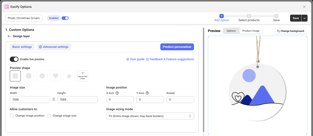
A. Basic settings: #
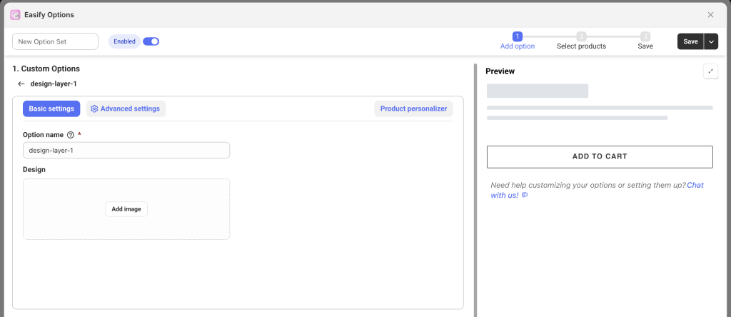
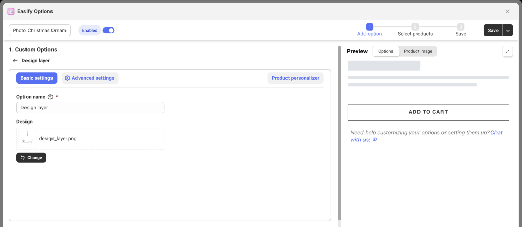
Option name: Give your Design layer option a unique internal name for management, which will not be visible on your storefront. Ensure that different options in the option set have distinct names.
Design: Upload the image you want to use as the Design layer.
B. Advanced settings: #
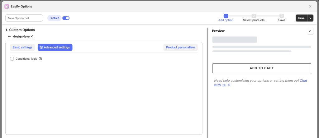
Conditional logic: Show or hide the Design Layer based on customers’ previous selections (e.g., a specific variant or option). To learn more on how to set up the condition logic, follow this guide.
C. Product personalizer: #
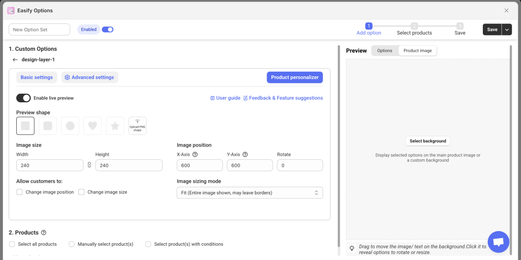
Just like setting up live previews for other option types, you’ll need to first set the background image for the preview, then position your uploaded Design layer precisely over it.
Learn more about setting up Product Personalizer – Live Preview in this guide.
👉 Important Note on Option Order (Layering):
The order of your options in the Option Set determines how they layer visually on the storefront preview. The option placed at the top will appear behind other layers, and each subsequent option will layer on top of it.
For example, if your product allows customers to upload an image (File upload), has a Design layer, and also lets customers add custom text on top, the correct order (top-to-bottom in your option set) is:
- File Upload (lowest layer – behind all other layers)
- Design Layer (appears above the uploaded image)
- Text Box & Number Box (top layers – appear above the design layer)
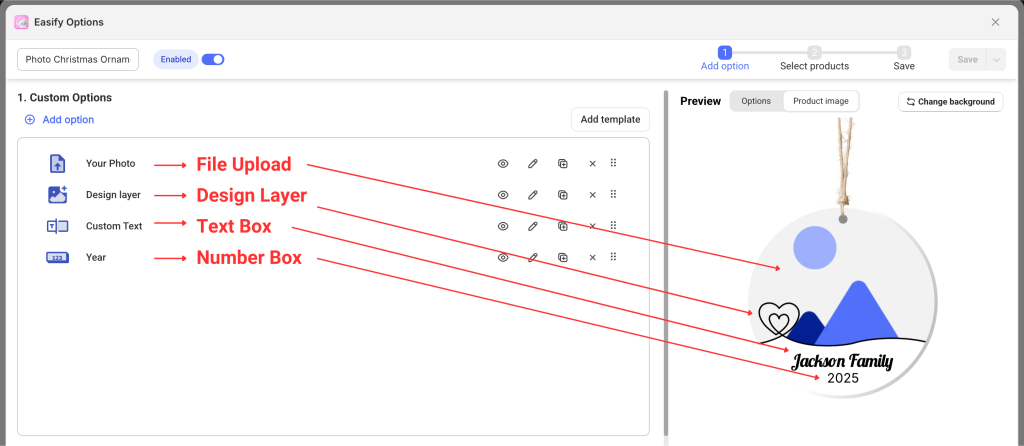
This ensures the storefront preview will display correctly, with the uploaded image at the bottom, the design layer above it, and the custom text clearly visible on top.
👉 Additional Notes:
If your option set is assigned to multiple products, and you’re using the product image (not a custom one) as the background for preview, make sure all the product images are the same size. Otherwise, the preview (including Design layer and other options) might not line up properly.
Need Assistance? #
If you run into any challenges while configuring your custom options, feel free to reach out to us for assistance through our convenient in-app live chat. We’re here to help!